Inside this Article
SimpleSite is Really One of the Simplest Ways to Build Your Website
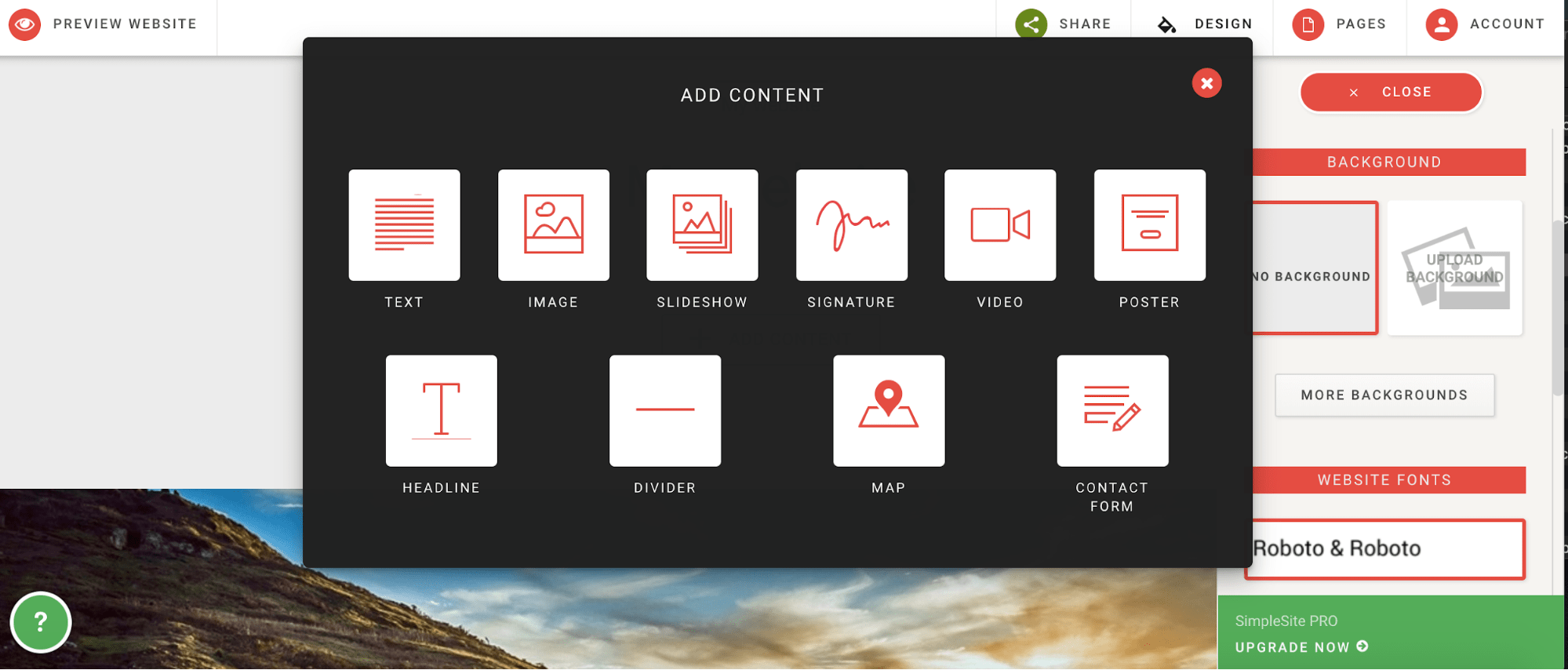
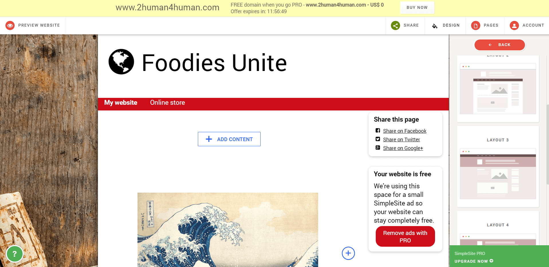
Although there are a few more steps than usual when signing up and first creating your SimpleSite website, the platform provides an incredibly handy step-by-step guide for beginners. You begin by selecting the purpose of your website. The first few steps cover choosing your website’s basic color scheme, a background image, and then a nice picture for the leading article on your home page. Then you’ll enter the title of your website before going through the sign-in process. Once you’re done, the guidance isn’t over, as there’s a follow-up tutorial to show you how to add content to your webpages. The builder itself is almost laughably easy to use, with little-to-no learning curve required. Your main ways of customizing your webpage layouts are through adding or removing content blocks (which could be text, images, slideshows, dividers, etc.), and then moving them up or down to sit above or below each other. Anything can be edited simply by clicking on it. For example, a text block will be opened in a simple text editor. The whole initial experience of using SimpleSite is just as welcoming as you can possibly get.But… It’s Very Limiting
It won’t take you long to start noticing the limitations of the SimpleSite website builder, and you might even get frustrated by them. Despite what a great platform it is for beginners to get a fairly decent-looking website up and running, it’s probably one of the most limiting builders around. First, there’s no real drag-and-drop functionality as you’d get with Wix or Weebly. To learn more about these platforms’ drag-and-drop features, feel free to read our Wix review here , or our Weebly review here . Secondly, you have access to a highly restricted range of content types that you can incorporate into your webpages. While it offers enhanced interactivity compared to the default WordPress.com builder, this distinction isn’t particularly substantial. This is where SimpleSite stands out by providing essential elements such as straightforward slideshows, text blocks, signatures, and maps. However, it’s important to note that the options available to you are somewhat limited in diversity, resulting in comparatively less flexibility for customization.
The crucial thing to realize is that SimpleSite’s purpose is to make it as easy, convenient, and stress-free as possible to create a website. That, unfortunately, means taking away some control so that any user with any level of expertise can build his or her website without fear.
There Are No Templates
I simply couldn’t beat around the bush with this one. If there’s one reason not to join SimpleSite, it’s that you won’t be able to start with gorgeous and feature-rich templates on which to build your website. For the same reason that you don’t have much control when customizing your website, to keep the process as simple as possible, the themes themselves are also quite basic. Everyone starts with the same basic template with the styling options applied that they chose in the creation process. The most powerful way you can then customize your webpages is by selecting from a list of layout variations for the webpage you’re editing. You also can’t custom-build a template by coding it from scratch. This is in stark contrast to many similarly priced or cheaper website builders that are popular in the market today. For example, you can get instant access to 30-50 templates in the case of Jimdo and Weebly, or hundreds of templates in the case of Wix or WordPress.com.
If variety is very important to you and you want to learn more about the best platforms for templates, feel free to check out our expert reviews of Wix here , or WordPress here .

Short on time?
Take this one-minute quiz to learn which website builders are best for your project.
You Can Run a Very Simple Store, Completely Free
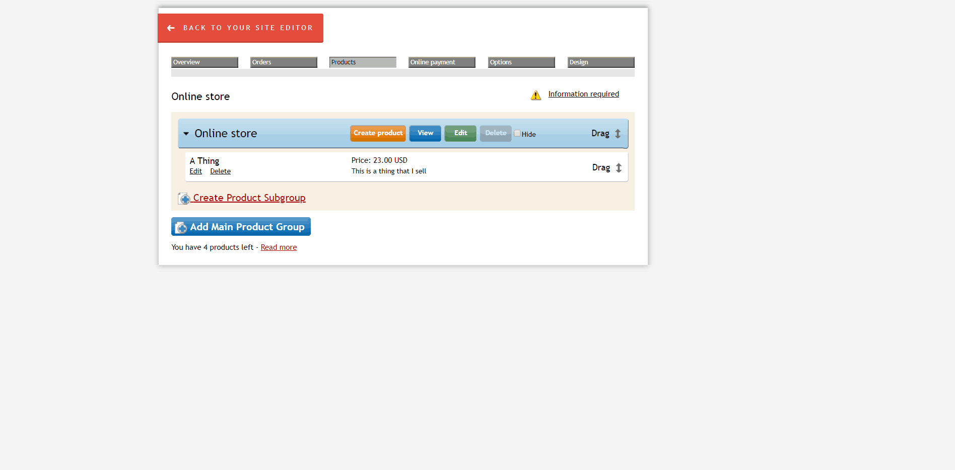
Probably one of the best aspects of SimpleSite’s pricing is that they offer one of the most generous free plans — so generous, that you can build a store and sell products on the free plan and without any transaction fees. This is almost unheard of. Of course, there are some restrictions. For example, you can have only five products, and this number increases to unlimited only with the most expensive E-Commerce plan. There are also no e-commerce specific templates to take advantage of, although there are basic product listing webpage creation tools. The other traditional e-commerce features are also very simple, with very basic reporting tools, simple order management, and PayPal as the only payment provider. The interface is a bit basic, but it’s in line with the ease of use and simplicity of the rest of the platform and will literally empower anyone to start selling online. Sure, you’ll definitely need to upgrade to the e-commerce plan soon if you have even modest ambitions for your website, but there’s no better way to get started than for free.


