Humble Beginnings – The $35 Swoosh
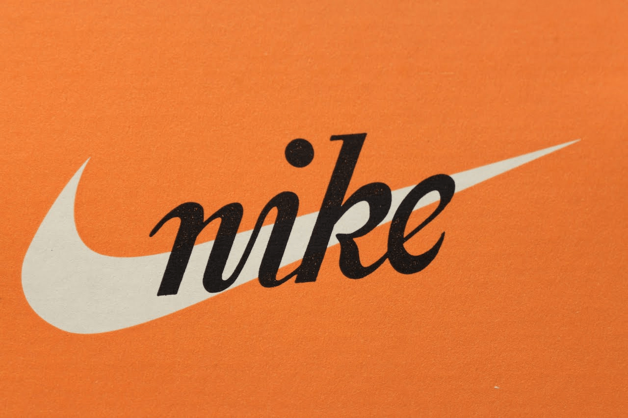
In 1971, Phil Knight was an accounting professor looking for someone to create a logo. The story goes that he overheard one of his students, Carolyn Davidson, mention that she needed money to take a class. Ever the businessman, he swiftly commissioned her to create an emblem for his new shoe design. The price he offered? A mere $35. Today, that money would be worth around $200, which is still incredibly cheap. Carolyn devised the concept and design in less than a day, citing 17.5 hours for the entire process. Her vision was simple: to portray the idea of motion. This straightforward clarity in her concept largely contributes to its eventual success. The “Swoosh” — whose name alone conjures up images of fast-paced athletes whizzing past your vision — became the embodiment of speed in sport. Her addition of the brand name in a hand-drawn script font only enhanced this illusion of smooth, streamlined action. And the geometric “check” shape acts as a testimony to the fact that a good concept is the key to creating branding that stands the test of time.
The Greek Goddess Of Victory
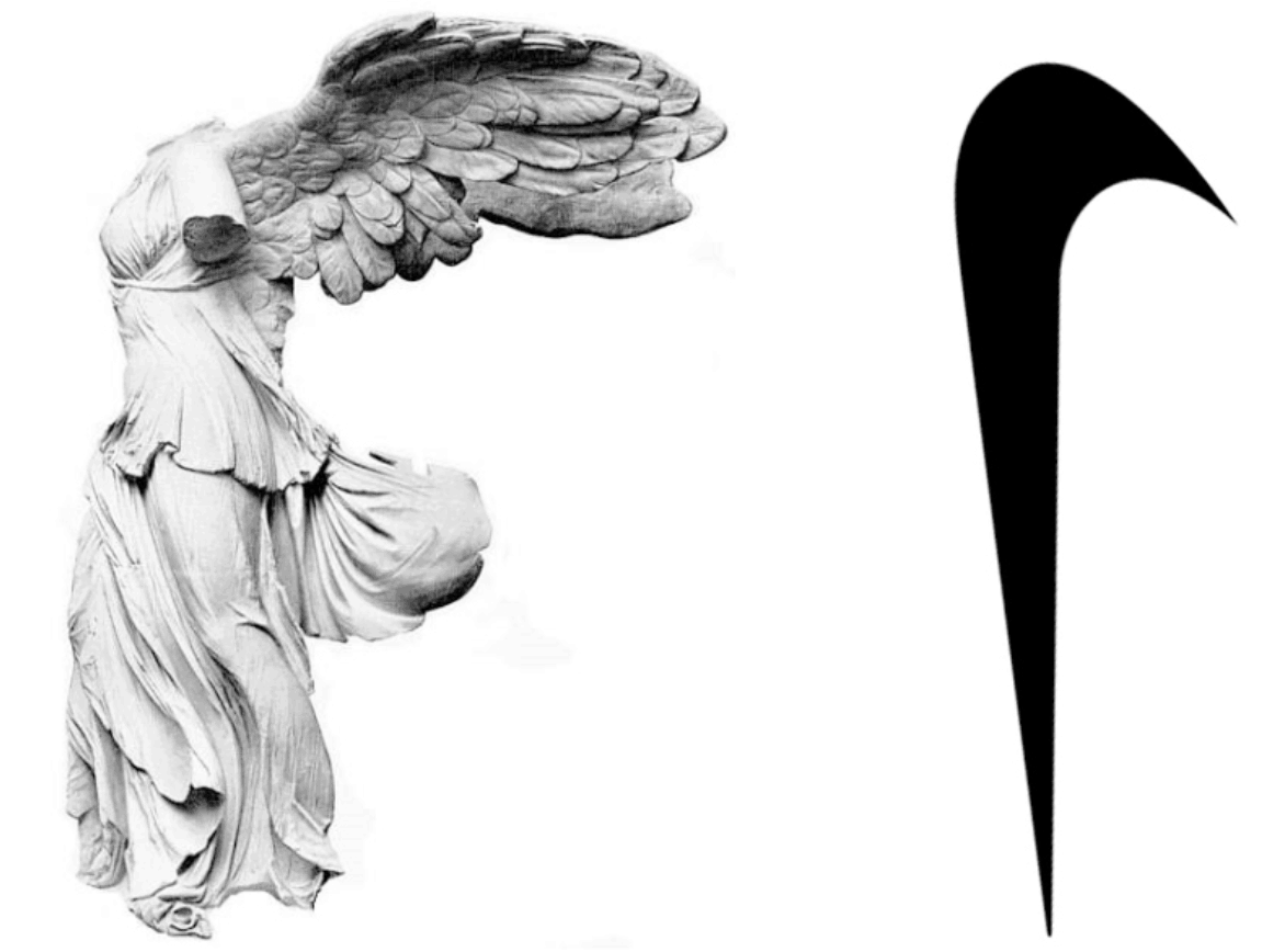
Not many know this, but the Nike brand was actually named after the Greek goddess of victory (pronounced Ny-kee.) The winged deity was known for swooping across battlefields, granting glory and fame to the victors. Her wings have long been a symbol of valiant success. Many experts have agreed that Carolyn Davidson’s famous Swoosh was based off of images of the goddess’s wingspan, as it mimics them in shape and meaning. What appears at first to be a simple, meaningless symbol actually has a deep contextual background. Although Nike never actively promotes their logo’s backstory, it’s this depth of thought that has arguably afforded it the international fame it enjoys today. However, Goddess Nike is not the only Greek figure who could have inspired the logo. Hermes, who just so happens to be the god of sports, was known for his unique choice in footwear. His winged sandals, named the “Talaria,” are prevalent throughout Greek mythology. Noted as being “as swift as any bird,” these magical shoes personified what the Nike brand was trying to create — namely, footwear that would make you unbeatable on the track. Once you understand that the swoosh represents wings, it’s easy to perceive shoes that sport the emblem as modern equivalents of the famed Talaria.
The 1978 Font Revolution
The cursive font designed by Carolyn Davidson worked initially. However, as the brand grew, it needed a writing style that matched its bold, pioneering outlook. The Nike logo went through its first evolution when it opted to use Futura Bold as part of the design. Placed above the Swoosh, it seamlessly integrated with the overall emblem, with the “E” of the brand name leaking into the swoosh itself. Everything about the chosen font personified the company:- Sans Serif fonts are a sign of modernity. Traditional typeface includes flourishes at the end of each line, known as serifs. The classic style is favored by vintage brands that want to communicate their established status. However, serif fonts can make your company seen aged and irrelevant. The sans-serif slab font used by Nike establishes them as a forward-thinking, innovative brand.
- Bold font communicates a bold statement. By 1978, Nike’s sales and profits were doubling on a yearly basis. Soon, they’d own 29% of the sportswear industry. No longer were they new to the game; now they needed a font that displayed their strength. Choosing Futura Bold ensured that their might as a company was properly displayed.
- Capitalized letters were another feature of the new Nike logo. In 2013, a study observed that “hero” brands frequently employed uppercase fonts. These companies were recognized for their energy, courage, and focus. As Nike’s popularity and strength expanded, they officially embraced capitalization in their logo, solidifying their position as a “hero” business.
- Kerning is a tactic that was originally used in metal typesetting but has since transferred to digital typography. It refers to the practice of off-setting the space between letters, so they appear to be equally spaced. One letter may overlap another, so the gap between doesn’t seem excessive. Although kerning doesn’t add context, it does add professionalism to the design, thus heightening the overall effect.
 The Nike logo was so effective that it didn’t change again for 17 years. Although there were periods when different background colors were added, the basic shape remained the same.
International Recognition
By 1995, Nike dropped their name in the logo altogether. After 25 years, the simple swoosh had become so iconic that it needed no introduction or explanation. In fact, it’s now regularly cited as being one the most recognizable logos of all time. Nike’s own research showed that 97% of Americans know the logo, and these statistics could easily be replicated right across the world. If you’re trying to brand your business, Nike’s story is an undeniable inspiration. It shows how you can define your company with even the simplest of symbols, to the point that it communicates your entire brand personality with ease. Today, the Swoosh is synonymous with athleticism, strength, and power. So, how did Nike manage to end up with an iconic and internationally recognizable logo?
Money Doesn’t Buy Success
When Phil Knight first saw the Swoosh logo, he wasn’t immediately sold. In fact, it’s reported that he said it may grow on him over time. On the surface, the story is largely unremarkable. However, both Carolyn Davidson and Phil Knight are responsible for providing the ingredients to make the logo a resounding success. Developing a Nike-quality logo isn’t about spending money. It’s about applying a combination of the following factors:Strong Context and Concept
The Nike swoosh is so simple that it’s hard to imagine there’s much of a story behind it. In reality, its inspirations are numerous and the concept is clear. Using Greek mythology to create a story behind the emblem ensures it has a depth that would be lacking if it had been designed on visual elements alone. Even though the inspiration isn’t even recognizable in the final product, the depth of thought was invaluable for creating a logo that communicates a strong brand message.Takeaway #1: Make sure your logo has a clear story and concept before you start designing.
Willingness for Progression
If Phil Knight and Bill Bowerman hadn’t commissioned a logo redesign in 1978, the Nike logo may not have reached the success it enjoys today. Very few people will remember or be able to recreate the initial font, but Futura Bold will now always be synonymous with Nike. It’s essential to remember that no logo design has to be the finished product. If you allow your branding to grow with your company, you’ll end up with art that truly personifies your vision.Takeaway #2: Accept that tastes and styles change, and be ready to adapt your logo as time goes on.
Outside-the-Box Thinking
If you need a logo, your first instinct may be to opt for an expensive design firm. However, cost doesn’t always equate with talent. Thinking outside-the-box and looking for alternate routes may actually inspire better results. At the very least, you can reduce the price tag, which is incredibly helpful if you’re a start-up with limited funding.Takeaway #3: Don’t automatically choose the expected route. If you have an opportunity to explore the road less traveled, then take it.
Trust in the Process
The fact that Phil Knight was not initially impressed with the logo, but allowed it to move forward anyway, speaks volumes about growth in business. It’s unlikely that your first attempt at branding will be a resounding success. If you spend too long agonizing over fine details, then you’ll end up never being happy. Often, trust in the process and an awareness that development will occur further down the line are what’s necessary to start your company’s forward trajectory.Takeaway #4: Don’t agonize over fine details; perfectionism can actually end up holding you back.
Create an Iconic Logo and Watch Your Business Thrive
The Nike logo is like a mythical legend of the branding world. It demolishes all the rules when it comes to quality and cost. Today, the Nike company is worth $34.7 billion, and its famous logo designer owns 32,000 shares in that fortune. While it’s not time to start hunting around the local college campus for the next Carolyn Davidson, there are valuable lessons you can learn from the process. If you’re looking to design a logo for your company, then heed this advice and you can end up with an iconic logo for an astonishing price!FAQ
What was Nike’s original logo?
The original Nike logo was the Swoosh symbol created in 1971 by Carolyn Davidson. It’s a geometric “check” shape, inspired by the images of the wingspan of Nike, the Greek goddess of victory. Initially, they wrote the brand name on the logo in a hand-drawn script.Why did Nike change its logo?
In 1978, Nike went through its first logo change by having the brand name written in the now-iconic Futura Bold font. This revolution came out of Nike’s desire to incorporate a bold writing style into its logo. Nike stuck to this logo version for 25 years when they decided to drop the name in the logo altogether. By that time, the swoosh had become instantly recognizable worldwide, so any additional explanation was redundant.What does the Nike logo represent?
The Nike logo stands for athleticism, strength, and power. It also shows how a good concept is the key to creating branding that stands the test of time. Check out some logo design stats and interesting trends to help you create your own branding concept.How do I create a professional logo?
Before you start designing, you need to make sure your logo has a clear story and concept. You should also be ready to think outside the box and take risks to bring better results. Finally, accept that tastes and styles change over time and that your logo needs to adapt to be successful. Use Nike’s inspirational story and find the right logo designing tools to help you execute your vision.Sources
https://anikabatista.wordpress.com/2013/10/27/nike-the-samothrace/
https://hbr.org/1992/07/high-performance-marketing-an-interview-with-nikes-phil-knight
https://www.nickkolenda.com/font-psychology/#fonts-p2-t15


![10 Best Logo Makers With Free Trials – (Actually Good) [2024]](https://dt2sdf0db8zob.cloudfront.net/wp-content/uploads/2018/08/LD-best-free-cheap-850x446.jpg)
![10 Best Logo Makers With Free Trials – (Actually Good) [2024]](https://dt2sdf0db8zob.cloudfront.net/wp-content/uploads/2020/09/1.jpg)
![How Much Is a Logo Design: Less Than You Might Think [2024]](https://dt2sdf0db8zob.cloudfront.net/wp-content/uploads/2024/06/LD-pricing-850x446.jpg)
![How Much Is a Logo Design: Less Than You Might Think [2024]](https://dt2sdf0db8zob.cloudfront.net/wp-content/uploads/2020/12/Dawn.jpg)


![9 Best Arabic Logos and How to Get One for Free [2024]](https://dt2sdf0db8zob.cloudfront.net/wp-content/uploads/2020/12/9-Arabic-Logo-Designs-and-How-to-Make-Your-Own-for-Free-850x435.jpg)
![9 Best Japanese Logos and How to Get One for Free [2024]](https://dt2sdf0db8zob.cloudfront.net/wp-content/uploads/2020/12/9-Best-Japanese-Logos-and-How-to-Make-Your-Own-for-Free-850x435.jpg)
![21 Best Signature Logos and How To Get Yours for Cheap [2024]](https://dt2sdf0db8zob.cloudfront.net/wp-content/uploads/2020/11/9-Best-Signature-Logos-and-How-to-Make-Your-Own-for-Free-850x435.jpg)


