Tip #1: DO Use Seasonal Color Schemes
Color is an undeniably essential factor. Over 92% of people say that visuals are the most important factor when making a purchasing decision, and 80% claim that color enhances brand recognition. Considering these statistics, making a change to your brand color scheme should not be taken lightly. However, around the Christmas season, color is one the key signs that holiday cheer is here. The following are all instantly recognizable Christmas color schemes:- Blue and Silver
- Red and Green
- White and Blue
- Silver and Gold
- Gold and Red
- Purple and White
- Red and Cream
Tip #2: DON’T Make Your Logo Unrecognizable
As previously mentioned, changing your branding colors can be risky. To add holiday cheer — and avoid a holiday nightmare — it’s essential to ensure that your logo doesn’t become unrecognizable. The best way to do this is by establishing which elements of your emblem truly define your brand. It could be the color, the font, the icon, or even the general layout. If you’re unsure, here are some examples:Color: Target
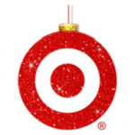
Target’s branding is so recognizable that you only have to see the red and white circle to place the company. However, if they did decide to change their color scheme, it would be much harder to understand who the brand was. Whenever Target releases seasonal branding, it’s always with the classic red and white icon, no matter which other elements are changed.


Font: Disney
The Disney logo is best defined by its iconic font. In fact, often the emblem is shortened to the first letter because the lettering is so distinctive. Because of this, Disney can easily change their logo color and still remain recognizable.Icon: Nike
The Nike tick is probably one of the most iconic logos of our time. The symbolism is notably simple, but it can be translated into any marketing campaign and still obviously be advertising the sports company. You can change the color, add text, or include a unique background and layout. However, if you took away the emblem, or covered it with another icon, then the brand impact would be taken away completely.Layout: BMW
Some brands, like BMW, design a shield or badge as their logo. When these companies alter the arrangement of elements within the emblem, the logo’s recognizability diminishes instantly. The arrangement of the components in the emblem carries greater significance than the choice of letters, font, or even color. Companies such as BMW have the flexibility to incorporate seasonal additions, but altering the placement is not an option, as it would result in the loss of their robust brand identity.Tip #3: DO Include Seasonal Icons
If you can’t change the color of your logo, you can still add festivity with different icons. Your choice of Christmas-themed objects is almost limitless. Choosing which one works best for you will depend on the visual aspects of your logo and the type of business you are. For example, an outdoors company with a nature-themed logo could change the image so it appears as a snowy landscape. However, if you sell bath products, then you’d benefit from using cozy, warming iconography — such as an open fire, Christmas candles, mistletoe or steaming Christmas pudding. Here’s a list of potential additions you can incorporate into your logo:
- Angel
- Bells
- Bow
- Candle
- Candy Cane
- Carols
- Chestnuts
- Chimney
- Christmas Cards
- Christmas Tree
- Decorations
- Eggnog
- Elves
- Evergreen
- Fir
- Fireplace
- Firewood
- Garland
- Gifts
- Gingerbread
- Holly
- Icicle
- Ivy
- Lights
- Mince Pie
- Mittens
- Mistletoe
- Ornaments
- Patridge
- Reindeer
- Ribbon
- Robin
- Santa
- Scarf
- Sleigh
- Snow
- Snowman
- Snowflake
- Stocking
- Tinsel
- Turkey
- Wrapping Paper
Tip #4: DON’T Overload Your Logo With Festive Cheer
The old adage, “less is more,” is an important idea to remember when designing your seasonal logo. The temptation to sprinkle Christmassy goodness over every element of your logo is understandable, but it could end up looking so overwhelming that you actually deter customers. The holiday season is already manic for most people. In fact, a study by eBay showed that 88% of Christmas shoppers experience tachycardia, with their heartbeat raising as much as 33%. If your branding looks over-cluttered and hectic, it’s not going to inspire them to engage in your marketing. However, minimalism in marketing is a growing trend that’s rapidly gaining popularity. Consumers respond better to simple, clean campaigns, and the holiday season is no exception. Minimalism has existed all throughout history: through Bauhaus, Russian Constructivism, American Minimalism, and Japanese design. The key principles include classic typography, simple composition, color blocks, and clear lines. By applying these rules when creating a seasonal logo, you’ll be sure to entice consumers to your brand, rather than scare them away.
Tip #5: DO Enlist Professional Help
If you’re a small-business owner, chances are that you don’t have a whole in-house design team to help you seasonlize your branding. You may have the design prowess to complete the edits yourself; if not, it’s highly recommended that you hire a professional. Although it will cost you money, it will also ensure that the final result is up to the highest standard possible. Experienced artists have the know-how to create sleek, stylish logos — so it helps massively to have one on the team. If you don’t have the budget to splash on a fancy design house, many online platforms give you access to freelancers for a fraction of the cost. The best logo design services utilize a mixture of AI and crowdsourcing to give you a professional design for a reasonable price tag. Contest websites, like DesignCrowd, allow you to post a brief that will be fulfilled by numerous designers. To learn more about this platform, feel free to read our DesignCrowd expert review . You pick your favorite design and don’t pay until you have an emblem you’re happy with. It’s easy to upload your current logo and ask the artists to add Christmas themes to it. On the other hand, you could use a more traditional outlet, such as Tailor Brands. Alongside their automated logo creator, they offer a whole package of branding deals. All price plans include a Seasonal Logo Generator, but you also benefit from bespoke business cards, social media graphics, presentation templates, and much more. Feel free to check out our Tailor Brands expert review to find out more.Seasonalize Your Branding For Christmas Success
An estimated $465 billion will be spent during the holiday season this year. To ensure your company gets a piece of that pie, you need to embrace the Christmas spirit. Adding festivity to your logo design is an easy way to be present and relevant during the shopping season. Use these tips to ensure your festive logo is on-brand, aesthetically attractive, and consumer-friendly.Sources
https://apiumtech.com/blog/key-statistics-colors-affect-sales-consciously-unconsciously/
https://www.dailymail.co.uk/sciencetech/article-3941672/Christmas-shopping-stressful-running-MARATHON-Hitting-high-street-increase-heart-rate-33.html


![How Much Is a Logo Design: Less Than You Might Think [2024]](https://dt2sdf0db8zob.cloudfront.net/wp-content/uploads/2024/06/LD-pricing-850x446.jpg)
![How Much Is a Logo Design: Less Than You Might Think [2024]](https://dt2sdf0db8zob.cloudfront.net/wp-content/uploads/2020/12/Dawn.jpg)


![9 Best Arabic Logos and How to Get One for Free [2024]](https://dt2sdf0db8zob.cloudfront.net/wp-content/uploads/2020/12/9-Arabic-Logo-Designs-and-How-to-Make-Your-Own-for-Free-850x435.jpg)
![9 Best Japanese Logos and How to Get One for Free [2024]](https://dt2sdf0db8zob.cloudfront.net/wp-content/uploads/2020/12/9-Best-Japanese-Logos-and-How-to-Make-Your-Own-for-Free-850x435.jpg)
![21 Best Signature Logos and How To Get Yours for Cheap [2024]](https://dt2sdf0db8zob.cloudfront.net/wp-content/uploads/2020/11/9-Best-Signature-Logos-and-How-to-Make-Your-Own-for-Free-850x435.jpg)
![9 Best Podcast Logos and How to Get One for Free [2024]](https://dt2sdf0db8zob.cloudfront.net/wp-content/uploads/2020/08/9-Best-Podcast-Logos-and-How-to-Make-Your-Own-for-Free-850x435.jpg)
