Inside this Article
Step #1: Choose a Domain Name for Your PortfolioStep #2: Choose the Right Website Builder and PlanStep #3: Consider the Structure of Your PortfolioStep #4: Pick a Template That FitsStep #5: Customize Your Online PortfolioStep #6: Showcase Your WorkStep #7: Write Some Smashing CopyStep #8: Make It Easy for Potential Clients To Get in TouchStep #9: Connect a DomainStep #10: Preview Your Online PortfolioTry to Have Fun with ItFAQ
Save up to 50 % on your Wix plan!
Sign up for an annual plan and enjoy the savings.
Plus get a free custom domain for 1 year!
8371 users used this coupon!
Step #1: Choose a Domain Name for Your Portfolio
There’s an art to choosing a domain name for any website (we have the comprehensive guide to prove it). But to be straightforward with you: your name and a simple .com should do the trick for a portfolio. If you have an artistic or company name, then use that. Making an impression is hard enough as it is. If your work resonates with someone, they will likely remember your name, while unnecessary information will only get in the way. Try variations if YourName.com isn’t available. My portfolio, for example, could be AndresGanem, AndresG, AGanem, DresGanem, and other such combos. The .com is important, too. It might be more expensive, but it’s the most popular TLD (Top Level Domain) in the world. That means that people will naturally remember the .com. You can always try our domain name generator to see what’s available.Pro Tip: Speaking of being memorable, a custom logo for your brand can work wonders for your portfolio. Wix has a logo maker that you can use for free with the VIP plan and up. Check out our review of the Wix logo builder for details.
Step #2: Choose the Right Website Builder and Plan
A self-hosted WordPress site gives you complete control over every aspect of your portfolio, but it requires time and expertise. Also, I can’t even remember if I brushed my teeth this morning. Do I really need control over everything? Website builders take care of the details and give you the tools you need to design your site quickly and easily. It could also be the cheaper option. Hosting, domain registry, and plugins can get expensive. Website builders typically offer all of this for less, and you know the price from the beginning. Some builders, like Wix or SITE123, have completely free plans. I wouldn’t recommend using these free plans, though, because having a Wix or SITE123 domain might look unprofessional. My advice is that you start with the cheapest builder that provides a custom domain. You can always upgrade if you need to. I created a portfolio with each of the builders below, and I believe they are the best for balancing ease of use and customizability. That said, the right one for you will depend on your particular needs.1. Wix – The Best Builder for Creative Freedom
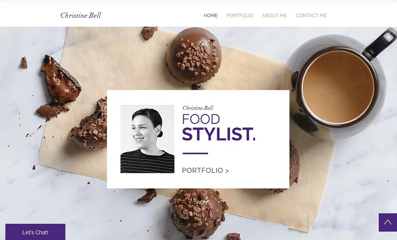
- Unrestricted drag-and-drop editor. Wix is the only builder that will let you place elements anywhere on a page.
- Special widgets for displaying your work. Features like masked videos or custom slideshows are an interesting way to show your projects.
- Over 800 templates. Each template is specifically designed for a different niche or industry, and you can edit them as much as you like.
2. Squarespace – The Best Builder for Visual Work

- Intuitive block editor. Although Squarespace might advertise its editor as “drag-and-drop,” it’s more of a block editing tool – and that’s a good thing. This restriction keeps Squarespace sites from becoming confusing or unbalanced.
- Professionally designed templates. Each of the 100+ templates is elegant and responsive.
- Third-party app support. There are plenty of third-party apps you can add to a Squarespace site to expand its functionality.
3. SITE123 – The Best Builder for Beginners
- A beginner’s tour. You can access a full walkthrough of how SITE123 works as soon as you make your first site.
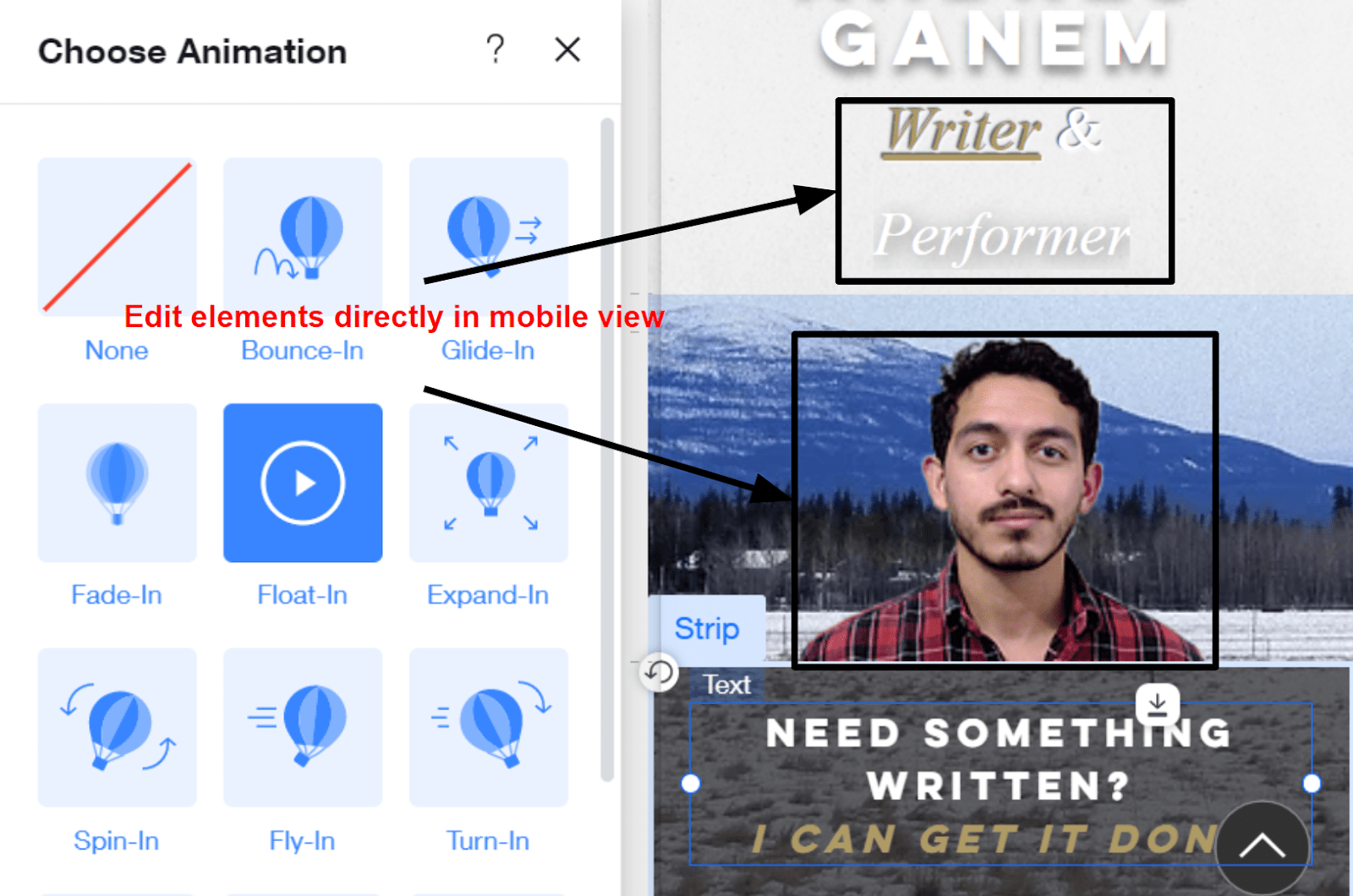
- Mobile responsive templates. The mobile view of your site is automatically updated whenever you make any changes.
- App market. Expand your functionalities with SITE123’s premium apps.
4. Zyro – The Fastest Builder Out There

- AI content creation. There are AI features for designing your site, creating a logo, and even writing content.
- Smart heatmap. Use activity tracking to improve the user experience of your pages.
- 24/7 Customer support. If you need help, you can contact Zyro at any time and get an efficient response.
| Best Feature | Portfolio Templates | Free Plan | Starting Price | |
|---|---|---|---|---|
| Wix | Limitless editor | 76 | ✔ | $17.00 |
| Squarespace | Stunning templates | 144 | ✘ | $16.00 |
| SITE123 | Fully mobile responsive |
6 | ✔ | $12.80 |
| Zyro | AI-created content | 10 | ✘ | $4.41 |
Step #3: Consider the Structure of Your Portfolio
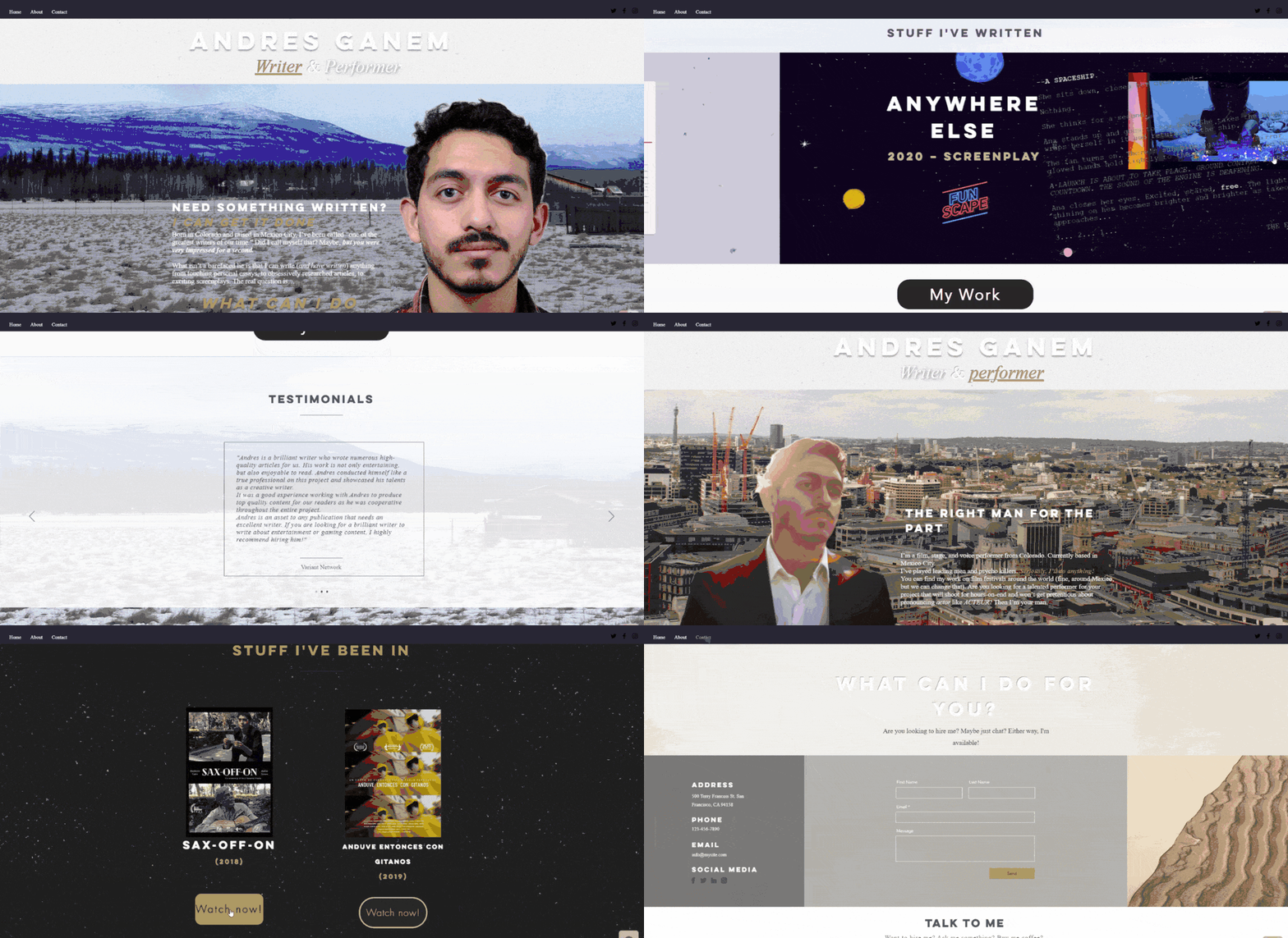
So, you’ve already chosen a kick-ass domain, and you know which builder is best for your specific needs. You can finally start building, right? Not yet. You need to know what you want from your site before you start. If you don’t, you could end up with a site that lacks any structure, or worse, end up with no site at all. I recommend that you:- Check other portfolios in your niche. Who do you admire in your industry? Who do you consider successful? For my writing site, I visited the sites of my favorite authors, even the ones with styles that differ from mine. Writing isn’t as flashy as photography or design, so I needed all the inspiration I could use to make my work stand out.
- Consider your personality. Researching other portfolios is great, but you need to remember that you’re unique. What makes you different? What makes your work one-of-a-kind? A fiction writer might need a site that conveys a certain tone, while a comedian needs a site that shows they don’t take themselves too seriously.
- Sketch out your site. Even if you can clearly see your portfolio in your mind’s eye, you need to make a design mockup. Mind’s eyes are famously unreliable, and removing stuff that doesn’t work will hurt a lot less when you are just erasing a drawing instead of throwing away hours of work.
Pro Tip: Design your site to be more scrollable than clickable. People feel like they’re making a commitment when they click on a site, which might deter visitors. Scrolling takes very little effort and can increase your engagement.
Consider that this structure isn’t set in stone. You can always make changes as you go. Once you know what you want your site to be, move on to the next step!

Short on time?
Take this one-minute quiz to learn which website builders are best for your project.
Step #4: Pick a Template That Fits
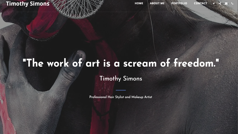
Templates can get as general as “photography CV” or as specific as “Textile Designer Portfolio.” Consider templates made for other niches too. If you replace all the photos of buildings with headshots, an architecture template might become great for a makeup artist. Compare your mockup with the different options. Which one’s the better match?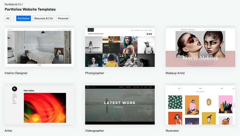
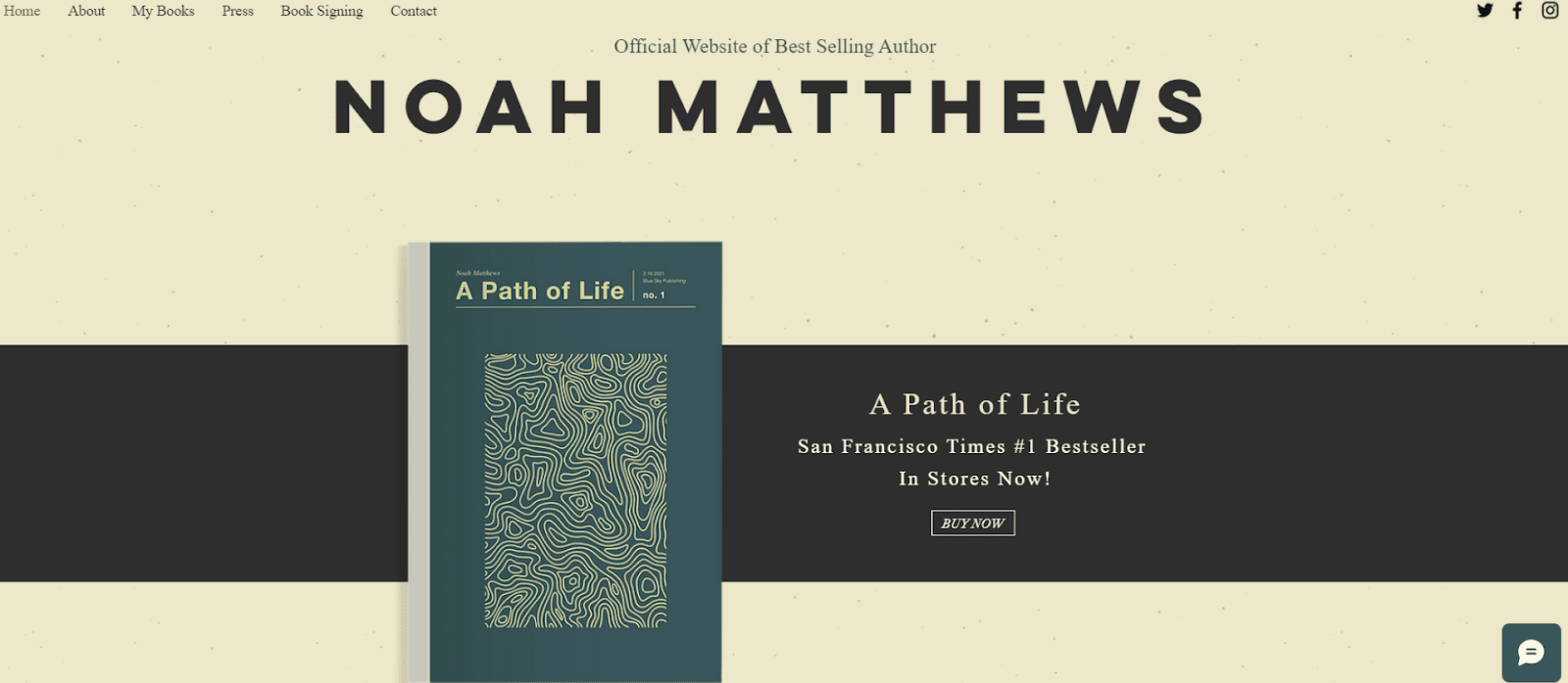
Step #5: Customize Your Online Portfolio
The customization process will be different for everyone. I’ll walk you through what I did and hope it guides you in the right direction. But if you find yourself yelling at the computer because of something I’m doing, maybe don’t do that. First, I designed the site using placeholders. Where I wanted a photo, I used vector art that I got from Wix. I’d put the classic “lorem ipsum” where I needed text, and so on. For me, this was lifesaving. Instead of obsessing over the little details, I got to think about the big picture.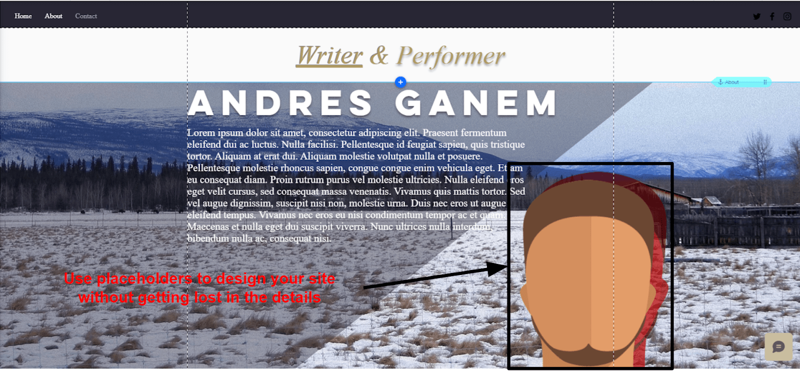
Step #6: Showcase Your Work
Yes, moving on from the homepage requires commitment, but that’s what the samples are for—convincing your viewers to make that commitment.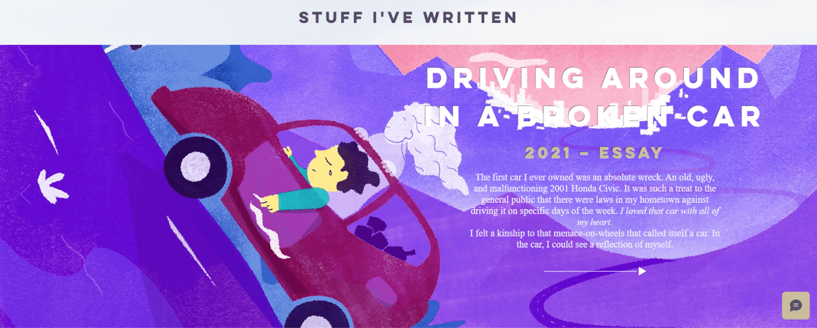
- Don’t show everything you’ve ever done. Choose your very best work. If you’ve only done one or two things that you feel proud of, display those two things as prominently as possible. Don’t mix them with a dozen other “okay” projects.
- Keep it simple. Choose one style for everything and stick to it. Try not to change background colors, fonts, or design elements between projects.
- Use external links. If your work has been featured anywhere important, link to it. Show a snippet and whatever feedback you’ve received. This creates interest and shows that you’re good at working with clients.
- Show a teaser, rather than the whole thing. Think of cliffhanger endings on TV. If you show an amazing part of a larger project, you leave viewers hungry for the rest.
- Make it visual, but don’t overdo it. This won’t be a problem for some niches. But if your work isn’t visual by nature, try to add a high-resolution cover image that goes well with it. These elements shouldn’t take attention away from your work; just keep visitors from getting bored.

Step #7: Write Some Smashing Copy
Good copy can be the difference between a good and a great portfolio. You shouldn’t fill your site with text, even if it’s a big part of your work (especially if it is), but you need to make sure that your copy is razor-focused on turning visitors into fans. How do you do that? Well, there are entire books about copywriting, so while I can’t tell you everything there is to know, I can give you some pointers.- Be direct. Imagine a single person scrolling through your site. Talk to them. Don’t say, “I offer professional photography services.” Say, “I can make your dog look great in a sweater.”
- Be personal. Offer some insight about yourself. We are in 2025. Your personal brand is worth as much as your work. How you talk about yourself matters as much as what you say.
- Be confident. This is your portfolio. If you don’t believe in yourself, why should others? Highlight your achievements and recognitions. Be upfront about the things that set you apart from the crowd.

Pro Tip. You don’t have to do everything on your own. You can find amazing and cheap copywriters on Fiverr.
If your copy is good, visitors will be impatient to contact you. That’s why you have to make it easy for them to do so.
Step #8: Make It Easy for Potential Clients To Get in Touch
You’ll find a preset template for a contact page on almost every builder. Just make sure your contact page is as striking as the rest of the site. The whole point of a portfolio website is for customers to reach you. If they click on the contact page, they’re at the finish line. A great heading and picture might be the final push they need. What might be less obvious but is just as important: make sure that visitors have a way to reach you at any point on your site. Wix includes a “show on all pages” option that I used to display a contact form at the bottom of every page. I also included social media buttons on the top right of each page.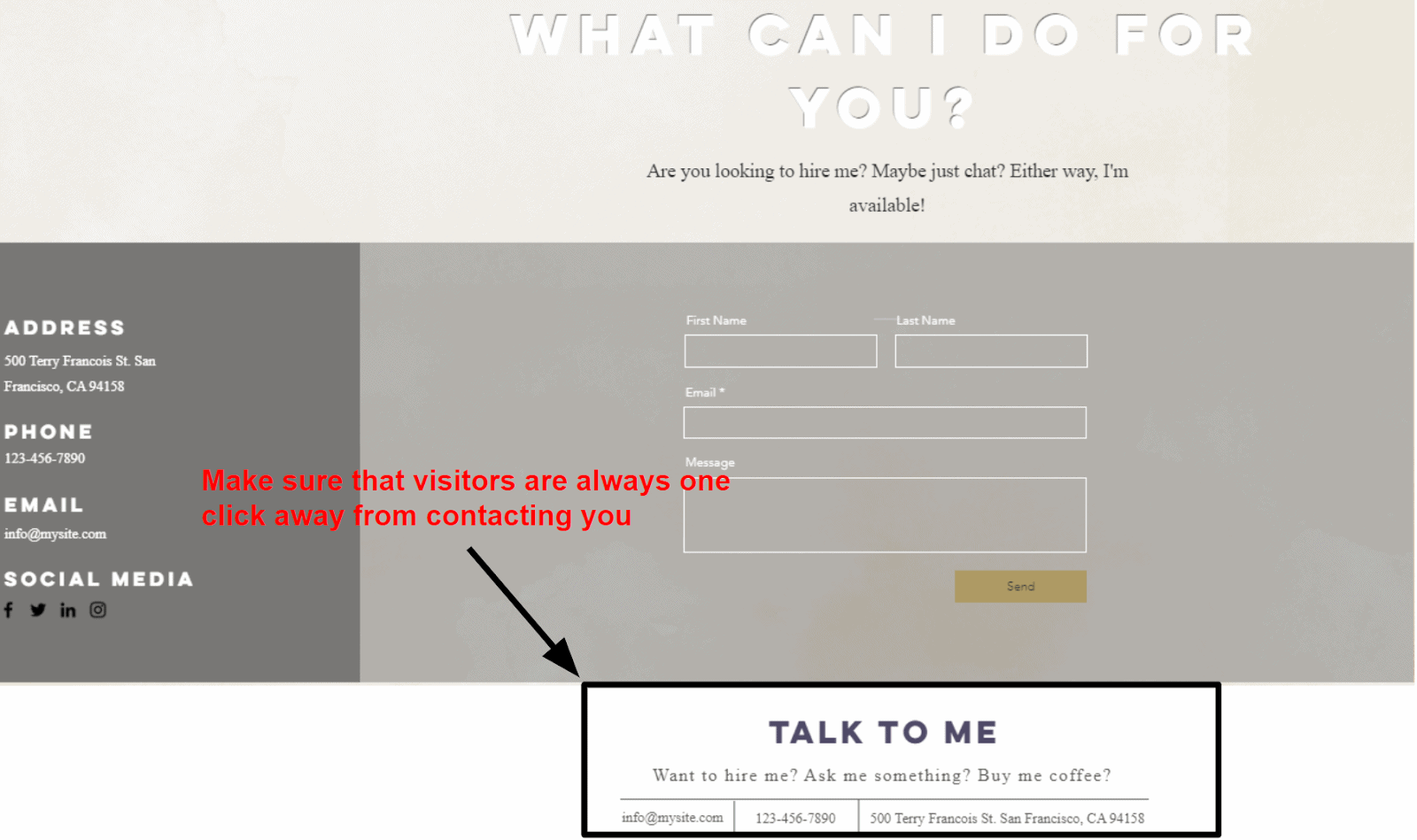
Step #9: Connect a Domain
Here’s another great thing about using a website builder: It’s super easy to connect a domain to your site. Get a custom domain name with one of Wix’s premium plans and you’re all set. To connect a domain with Wix, simply navigate to your site’s settings, locate the “connect a domain” option, and enter your domain name. It’s worth noting that even if you are not using Wix, most website builders offer a complimentary domain for one year with any premium plan. You’re almost done. Just make sure you preview your site before going live.Step #10: Preview Your Online Portfolio
Before you release your website to the world, preview it a couple of times. If you can, show it to a friend. Get their opinion. Does it look good? Does it feel the way you want it to? Would your friend hire you based on your site?