Inside this Article
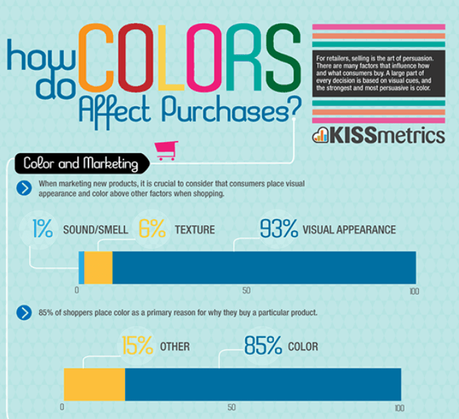 Sure, factors such as culture, upbringing, personal preference, experiences, and context also influence the effect an individual color has on a consumer. Studies on color psychology confirm this. Still, there are universally accepted standards or expectations when it comes to how your logo’s colors impact your brand and sales.
Regardless of whether you work with an in-house logo designer or with logo-designing services offered by platforms like Tailor Brands, DesignCrowd, and HiretheWorld, you should never underestimate the power of the color choice for your logo. So before having your next logo designed, ask yourself this: Do the colors you’ve chosen evoke the emotional reaction and connection you want to achieve with your target audience?
Why Does Color Matter?
1. Color Evokes Emotions
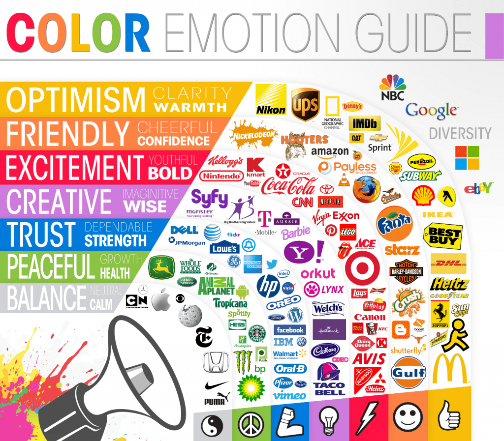
Color has an impact on the feelings a logo evokes, as humans associate certain colors with specific emotions. Those emotions can engage your audience and help them more easily remember your brand. Before choosing your logo’s colors, first determine the message you wish your logo to convey. Numerous studies have confirmed the following color/meaning associations:- Red. Think of “Stop” signs, giant “ON SALE NOW!” posters, or the big buttons to press for time-sensitive action They’re all red and convey urgency, which might be why humans naturally associate the color that way. Designers use red in high-energy context to convey a sense of urgency or boldness. Red almost automatically makes you respect the logo. Who doesn’t want that for their brand?
- Green. Most plants in jungles and forests are green, so naturally many people associate the color green with the qualities of good, healthy, peaceful, and organic. It can be used to convey relaxation or to bring attention to environmental issues. Greenpeace’s logo is a good example.

- Blue. If you want to send a message of trustworthiness to your clients so they feel it’s safe to do business with you, you can do that without saying a word. Just use the color blue in your marketing materials, including your logo. It will bring a sense of calm, balance, and tranquility to your prospects.
- Yellow. Yellow is the color of the sun, which is a source of energy and life. Therefore, the use of yellow gives viewers a cheerful and optimistic energy. Regardless of whether it’s the shade of a banana or a lemon, or of gold, mustard or honey, yellow inspires feelings of positivity and happiness. Just think of the yellow arrow in the “Amazon” logo resembling a smile.

- Orange. Similar to yellow, the color orange beams with fun, warmth, and enthusiasm. For example, the brand “Fanta” uses the color orange as the main color on its logo, reflecting an image that the drink is zesty and fun.

- Black and silver. The color black conveys power, elegance, boldness, and sophistication. Silver is a symbol of class and sophistication, but with a little bit of mystery surrounding Use one or the other (or a combination of both) if your brand is about spirituality and mystery. Examples include Apple’s and Puma’s logos.

- Pink and purple. These two colors shout out femininity, youthfulness, and creativity, and they’re frequently used to promote beauty products aimed at female consumers. A good example brand is
 Rather than just focus on the aesthetics of your chosen colors, also take the time to really consider what each of them might mean to your target audience.
2. Color Attracts Attention
When someone looks at any logo, the first thing he or she probably notices is the color it contains. This reflects market research, which indicates that 80% of all the visual information the human brain takes is related to color. First impressions of a brand usually last for 90 seconds or less, so for a brand to make a lasting impression it needs its logo to stand out — to be memorable, and ultimately become iconic. Some brands whose logos have achieved icon status, and which readily come to my mind, include Coca-Cola, Pepsi, McDonald’s, and KFC. Besides the fact that there are no more than three colors in each brand’s logos (so the combination of colors is simple enough for people to remember), another thing they all have in common is that they use bright, eye-popping colors like red, which screams “Look over here!” Other companies that effectively use bright red as the main color include Kmart, Lego, Canon, Heinz, Avis, Nintendo, and CNN. Other colors that attract attention are bright yellow and orange. They’re especially prevalent in the logos of various security agencies that need to be quickly and easily noticed.

3. Color Conveys a Message to Your Market Segment
Your logo’s color communicates your company values to your target group. Based on their age, gender, interest, lifestyle, and geographical area, they will relate more with one color than another. Consequently, each market segment responds differently to different colors, and the same color has different meanings in different settings. For example, the color green in Ireland is associated with good luck (think clovers); however, in many places around the world, green also has close ties with Islam. In addition, the climate also influences what impact certain colors have on people. For instance, people in tropical countries prefer warm colors, whereas people in northern climates respond more favorably to the cooler colors.4. Color Becomes Synonymous With the Brand
At the beginning of a brand’s life cycle, no one knows the name of the brand behind the logo, so the company often spells out the name around the logo. For instance, although the Nike logo is now commonly seen as a swoosh, for much of Nike’s history beginning in 1971, “NIKE” was incorporated alongside the swoosh. But when the brand achieves worldwide success and becomes iconic, the brand name often drops out, leaving behind only the logo’s design and color. When that happens — as it did with Nike — often consumers begin to synonymize the color with the brand. Tiffany & Co.’s logo is a good example. The shade of blue that serves as the background for Tiffany’s name is now known all over the world as “the Tiffany Blue.” Over time, the color or colors you choose for your logo will imprint themselves in your consumers’ minds. That’s why it comes as no surprise that some companies trademark specific color combinations to safeguard their brand against other brands in the same market that might employ identical or akin colors. For instance, in 2000, T-Mobile officially registered its unique shade of magenta. From that point onwards, T-Mobile has prominently featured this color in both their stores and promotional materials.
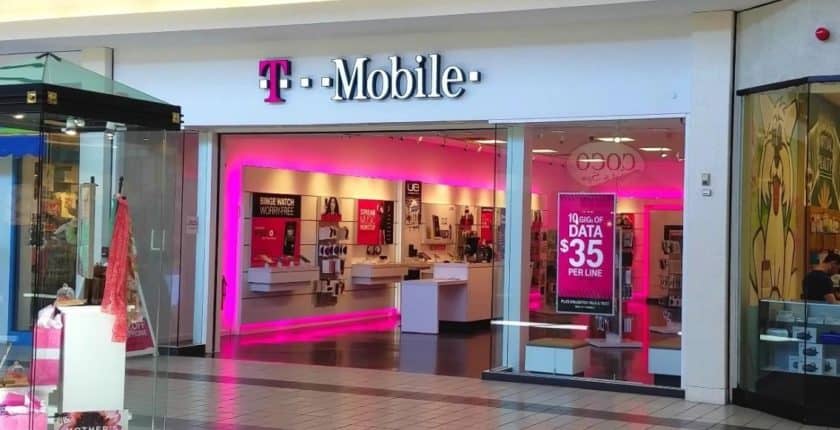 To make their brand more recognizable, companies often use the same colors on everything, including their advertisement, uniforms, packaging, store décor, and many more. Your goal should be for your audience to think of your brand when they see the shade of color you use for your brand and logo.
So, When Choosing Colors For Your New Logo…
Avoid making these mistakes:
- Mismatch your company’s personality with the logo color
- Use colors that are offensive in the environment and culture where your business operates
- Make your logo dull and drab
Instead, do the following:
- Identify who is using your products and adjust the colors of your logo to your target audience
- Conduct market research so the colors you choose perfectly represent your niche, your brand’s personality, and your ideal buyer persona
- Perform frequent split-tests on color schemes to assess your audience’s reactions to your logo
There’s No Good or Bad Color — But the Right Color Helps
It’s impossible to please everyone when it comes to the choice of your business’s logo. And the idea that one color always converts better than another is unreasonable because there’s simply no universal “best” color. However, there is an “inappropriately colored” logo — and that color can be a massive turn-off for your potential customers. The choice of colors for your logo should be a part of a greater marketing strategy for attracting customers. For successful sales, ensure data-driven branding that touches the hearts, minds, and color sensibilities of your target customers.Color psychology study: https://www.ncbi.nlm.nih.gov/pubmed/2289687 Market research stats: https://www.colormatters.com/color-and-marketing/color-and-trademarks IMAGES How do colors affect Affect Purchases?: https://postfunnel.com/3-striking-steps-use-color-psychology-glowing-sales/ Color psychology examples: https://justcreative.com/2018/02/19/color-psychology-in-logo-design-branding-explained/




![9 Best Arabic Logos and How to Get One for Free [2025]](https://dt2sdf0db8zob.cloudfront.net/wp-content/uploads/2020/12/9-Arabic-Logo-Designs-and-How-to-Make-Your-Own-for-Free-850x435.jpg)
![9 Best Japanese Logos and How to Get One for Free [2025]](https://dt2sdf0db8zob.cloudfront.net/wp-content/uploads/2020/12/9-Best-Japanese-Logos-and-How-to-Make-Your-Own-for-Free-850x435.jpg)
![21 Best Signature Logos and How To Get Yours for Cheap [2025]](https://dt2sdf0db8zob.cloudfront.net/wp-content/uploads/2020/11/9-Best-Signature-Logos-and-How-to-Make-Your-Own-for-Free-850x435.jpg)
![9 Best Podcast Logos and How to Get One for Free [2025]](https://dt2sdf0db8zob.cloudfront.net/wp-content/uploads/2020/08/9-Best-Podcast-Logos-and-How-to-Make-Your-Own-for-Free-850x435.jpg)


