We rank vendors based on rigorous testing and research, but also take into account your feedback and our commercial agreements with providers. This page contains affiliate links. Advertising Disclosure
Creating the perfect lawyer website can be challenging but possible with the right tools. A well-designed website showcases your expertise and services and builds trust with potential clients. It also helps you streamline the user’s journey from inquiry to consultation.
To help you achieve a website that does it all, I’ve compiled a list of the best lawyer website examples. These sites stand out for their exceptional design, user-friendly navigation, and effective communication of legal services.
Whether you’re a solo practitioner or part of a large firm, my examples will provide inspiration and practical ideas to improve your online presence. From minimalist and sleek to bold and informative, I’ve selected each website for its ability to connect with clients and convey a professional image. Let’s dive into these outstanding examples, and I’ll let you in on a few design tips for your lawyer website.
Did you know you can create an attractive website for your law firm really quickly? Wix has 5 different templates for lawyer websites. These templates are aesthetically pleasing and also come equipped with many essential features, like online appointment scheduling, client testimonial sections, and customizable contact forms.
Simply choose the template you like best, add your images and text, and you’re all set to launch!
Wix’s tools can help you craft a lawyer website that stands out. Hover over to see more
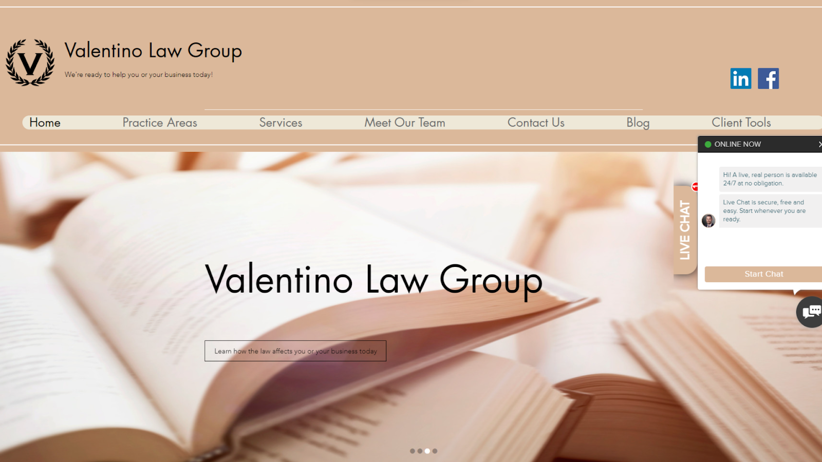
Visit website at: https://www.valentinoatlaw.com/
The Valentino Law Group has a clean, modern layout with a simple, neutral color scheme. The navigation menu provides easy access to essential information, but what I like best is that a 24/7 live chat pops up when you open the website. This makes the firm look approachable and calls for immediate action from the visitor.
High-quality imagery adds visual appeal, underscoring the firm’s professional brand. The dynamic slideshow on the homepage and the video on the payment page add an engaging element to the website. This movement captures the reader’s attention and keeps them interested.
I like the minimalist look of this lawyer website created with Wix. Hover to see more
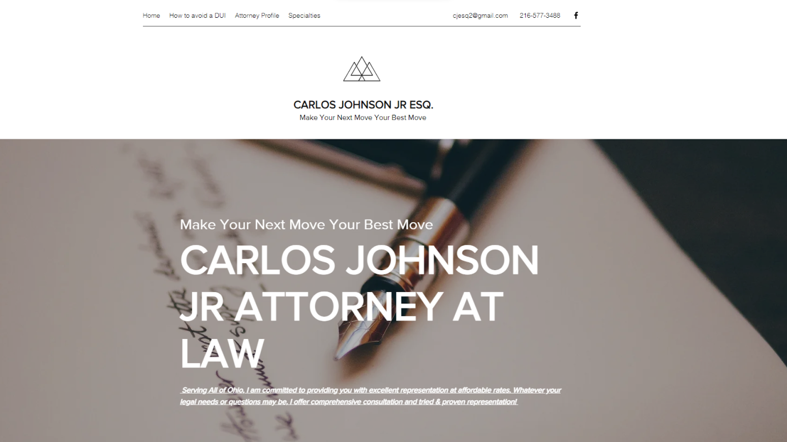
Visit website at: https://www.bestcleattorney.com/
This website uses one of Wix’s best features: parallax scrolling. Parallax scrolling means background images on a webpage move slower than the foreground images or text as you scroll down the page. This creates a sense of depth and motion as visitors navigate through the site. The zig-zag arrangement of images also breaks the monotony of traditional vertical layouts. These design elements make this lawyer website both informative and modern.
I also appreciate the inclusion of a blog on the website. It’s great inspiration if you’re looking to showcase your expertise and connect with your audience. Let’s be real – people love free legal advice.
Pro Tip. Concerned about your law firm website not meeting your expectations or lacking the time to create it? Consider hiring a professional designer. This doesn’t necessarily mean a hefty investment.
You can hire a designer for as little as $5 on a top freelance platform like Fiverr. You can find a designer to craft an attractive website on your favorite platform, even if you’re on a budget.
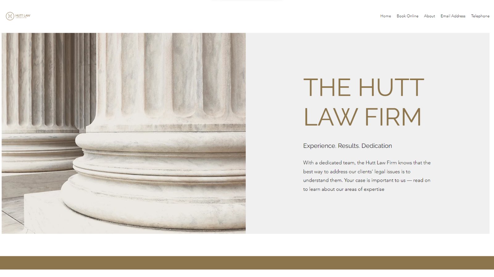
This is another elegant lawyer website made with Wix. Hover to see more
Visit website at: https://www.thehuttlawfirm.com/
This is another great example of Wix’s parallax scrolling done well. The result is pretty and elegant, but what I love about this template is that they’ve thought about the details, too. Notice how the font used throughout the website matches the firm’s logo.
Apart from the tasteful design, this website offers a practical and user-friendly feature – the ability to book consultations online directly through the site using Wix Bookings. This feature streamlines the process for potential clients, making it easier and more convenient to schedule appointments without the need for emails or phone calls. Plus, this feature is seamlessly integrated, maintaining the website’s clean aesthetic.
Short on time?
Take this one-minute quiz to learn which website builders are best for your project.
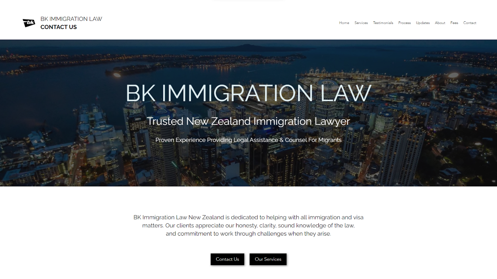
This law firm website has a testimonial section, which enhances credibility and professionalism
Visit website at: https://www.bkimmigrationlaw.com/
I was impressed with this website’s dedicated testimonials page, which is a wonderful idea for a law firm. This section offers a transparent and personal glimpse into the experiences of past clients, adding a layer of trust and credibility to the firm. It’s a great way to show success and reliability – in this case, in handling immigration and employment law cases.
In addition to the testimonials, I like the website’s simple, modern design that adopts a professional color scheme and layout. It strikes the right balance between sophistication and accessibility. The titles and buttons in the contrasting color scheme make it easy to find important information, like services and contact details.
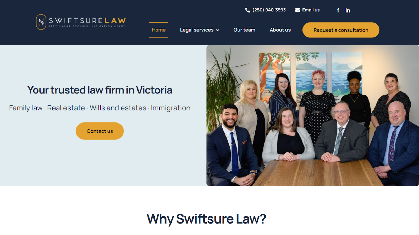
You can combine contrasting colors like blue and orange to create a striking visual effect on your website
Visit website at: https://www.swiftsurelaw.ca/
This website has an elegant and clean layout and a soothing color palette that reflects the firm’s professionalism. I particularly like the orange accents, which give it more character. This design approach, combined with high-quality images and a clear, readable font, creates a welcoming atmosphere for visitors.
Functionality-wise, one of the site’s standout features is its comprehensive Our Services section on the homepage. This area is thoughtfully organized, allowing potential clients to easily navigate the various legal services offered. The clear categorization and detailed descriptions of each service provide valuable information at a glance.
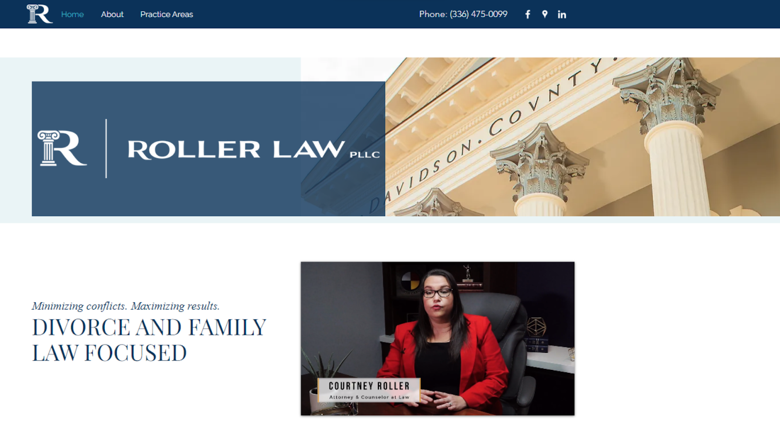
To add a personal touch to your law firm website, add a presentation video of you or your colleagues on the homepage
Visit website at: https://www.courtneyrollerlaw.com/
A standout feature I found on this website is the presentation video prominently displayed on the homepage. This video offers a personal touch, introducing visitors to the firm dynamically. Such a multimedia approach effectively captures attention and builds a connection.
In terms of design, the website is a model of organization and clarity. The color scheme – a tasteful blend of white and two shades of blue – creates a cohesive look throughout the site. Each practice area is clearly presented on the homepage with an accompanying image and a Learn More button, guiding visitors to further information.
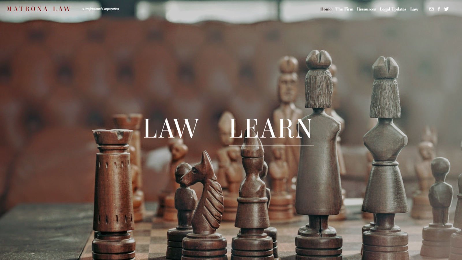
This website makes it clear from the start it values professionalism with this breath-taking homepage
Visit website at: https://www.matronalaw.com/
This website introduces an innovative and user-centric feature right on its homepage: the option to choose between two different versions of the website. You have two words to click on, Law and Learn, each with a different background image. The Learn section is filled with useful resources, from articles to various legal updates.
The website’s layout is clear and uncluttered, with a warm color scheme and an interesting, elegant font. This ensures the spectacular homepage is consistent with the site’s overall professional appearance.
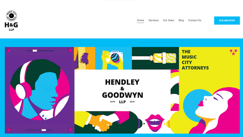
You can create a website that matches the energy of your expertise area
Visit website at: https://hendleygoodwyn.com/
This website goes for a memorable look with a clear, concise layout. The use of bold colors and high-quality graphic elements immediately captures the visitor’s attention. The clean typography makes reading and navigating almost fun. The overall aesthetic suggests the firm’s expertise in areas like intellectual property and entertainment law.
I really like the interactive nature of the site’s elements as well. When you scroll, the pictures appear with a different visual effect, including the firm’s equally colorful logo at the very bottom. The contact form at the end of each page changes its color scheme to match the vibe of the other elements, which is another nice touch.
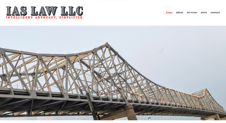
You can make a great lawyer website using a blog-style template
Visit website at: https://www.iaslawllc.com/
This website impressed me with its modern homepage. The site greets visitors with an engaging, full-screen image slider, adding an impactful contemporary feel. The use of bold, clear typography against these vivid images makes the site’s message stand out.
I like that the layout is intuitive, making use of a blog template in a creative way. These testimonials are not hidden from sight but are front and center on the homepage, emphasizing the firm’s care for client satisfaction. I also liked how exhaustive the About me page is (you have to scroll a bit to see it all).
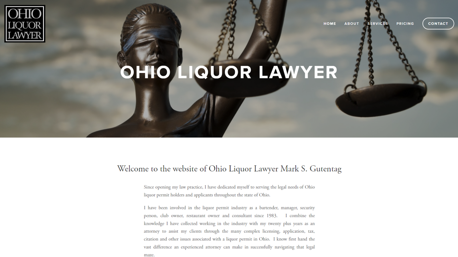
This is a great example of how you can catch the eye of the visitor using large header images
Visit website at: http://ohioll.com/
The home page welcomes visitors with an elegant monochrome theme, accented by crisp images. The visual hierarchy is well-executed, with large, bold titles that guide the eye. The contrasting call-to-action buttons are smartly positioned to invite further engagement.
The site’s Services page design allows different visitors to choose the path they need. While navigating between the 3 services, the title and the header image change, while the rest of the page stays the same. This ensures a cohesive experience.
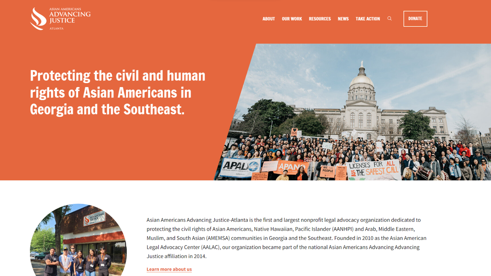
You can make a professional-looking lawyer website while still using a warm, cheerful color palette
Visit website at: https://www.advancingjustice-atlanta.org/
This lawyer website focusing on civil and human rights is strikingly visual with a carousel of images that immediately highlight key issues and campaigns. Its bold color scheme and clear fonts command attention and action.
The site excels with its prominent Get Help feature and social media integration, ensuring visitors have instant access to resources and the latest community updates. This makes a perfect blend of form and function for advocacy.
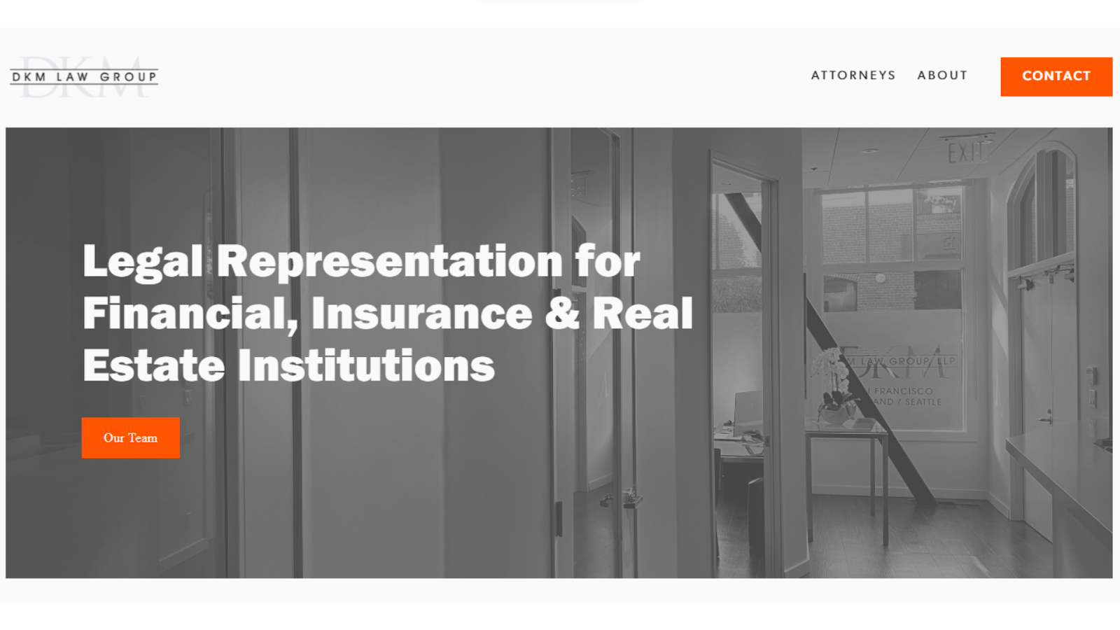
You can make all pictures on your website black and white while adding a bold accent color for a visually stunning effect
Visit website at: https://www.dkmlawgroup.com/
This website presents a minimalist aesthetic that highlights specializations in financial, insurance, and real estate law. Ample whitespace, striking orange accents, and bold text direct focus to the firm’s key services and regional presence in several states.
Navigation is seamless, zeroing in on the firm’s legal team and expertise in commercial matters. Each attorney has their own page with a complete bio and picture, which is especially admirable for a small firm.
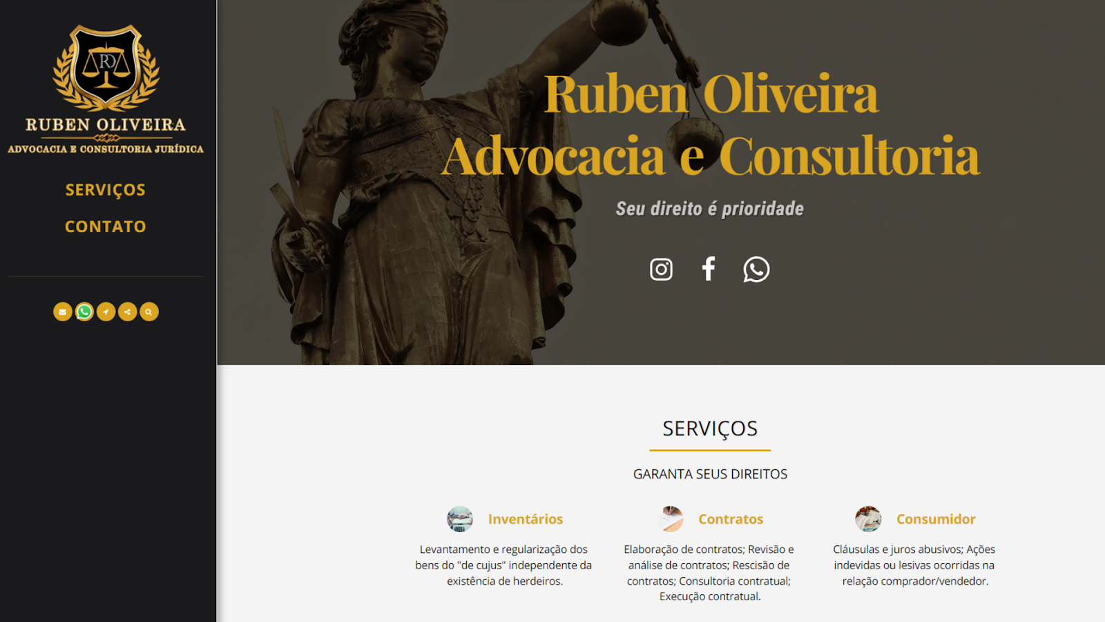
You need to make sure communication channels are easy to spot on your homepage
Visit website at: https://www.rubenoliveiraadvocacia.com/
This website showcases a direct and clear-cut design that immediately brings the firm’s service offerings to the forefront. I really like the black-and-gold color scheme, which makes for a distinctive look.
The homepage prominently displays social media links and a WhatsApp contact button. This arrangement facilitates instant dialogue between the firm and potential clients, enhancing direct communication.
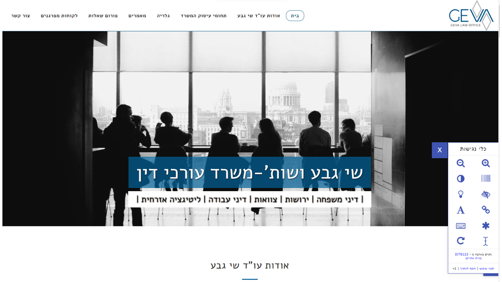
You can add an accessibility toolbox from SITE123 like the one on the right, which has options like reversing the color scheme or enlarging the text
Visit website at: https://www.geva-att.co.il/
This website is in Hebrew, and it’s a great example of a site in a different writing system that still has an elegant design.
Moreover, the site’s accessibility toolbox powered by SITE123 is a standout feature, offering options like text zoom and color reversal to accommodate users with different visual needs. This commitment to accessibility demonstrates the firm’s dedication to providing an equitable online experience for all visitors.
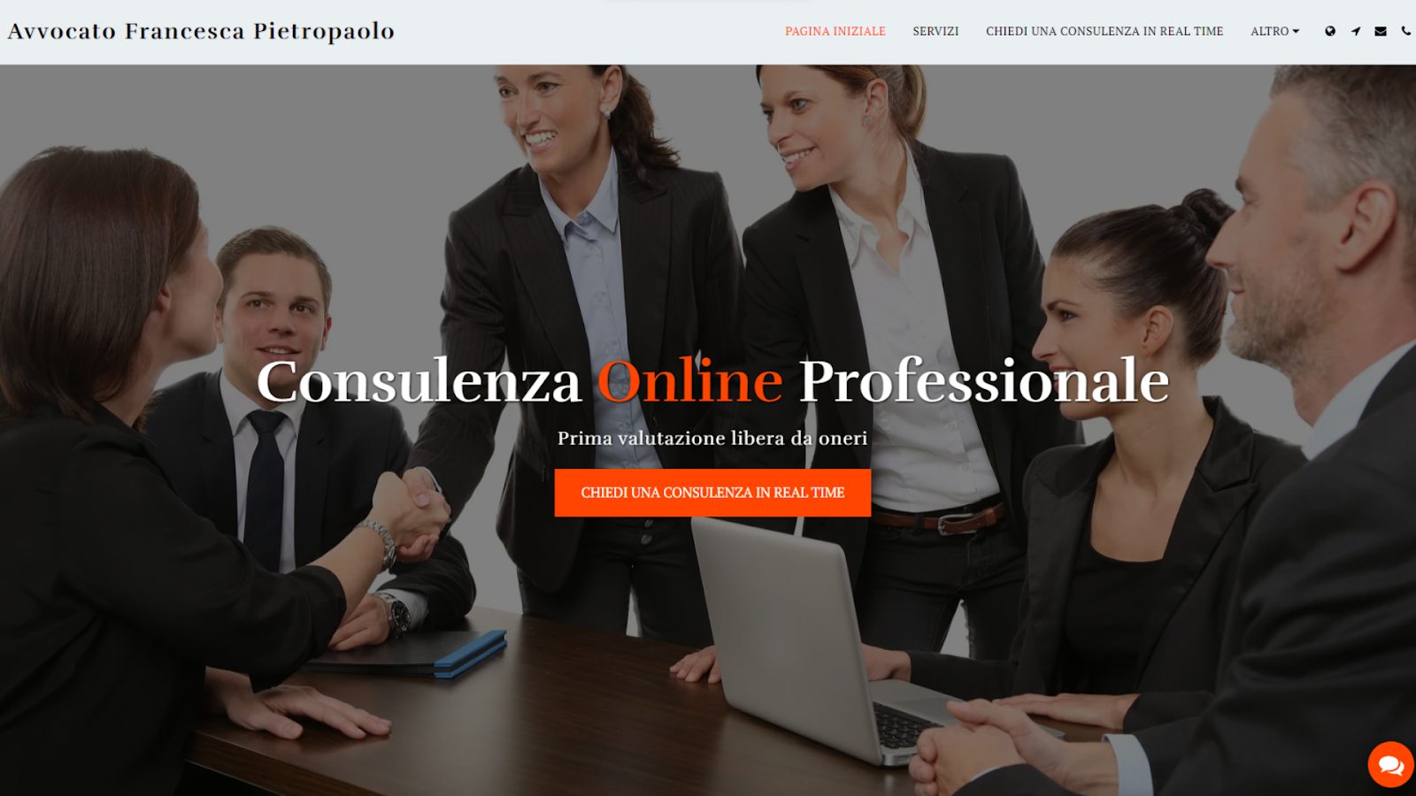
I like how email and call buttons are displayed in the corner of every page
Visit website at: https://www.avvocatopietropaolo.com/
This website’s elegant design and intuitive navigation makes finding information on legal services like corporate consulting straightforward. The refined color palette and professional imagery reflect the firm’s sophisticated approach to law.
The site also offers areal-time consultation feature, highlighting the firm’s dedication to accessibility and immediate client support.
Other Notable Lawyer Website Examples
Browsing through the internet, I found many standout lawyer websites that blend legal know-how with impressive design. I listed the ones I liked best above, but here are a few more worth mentioning:
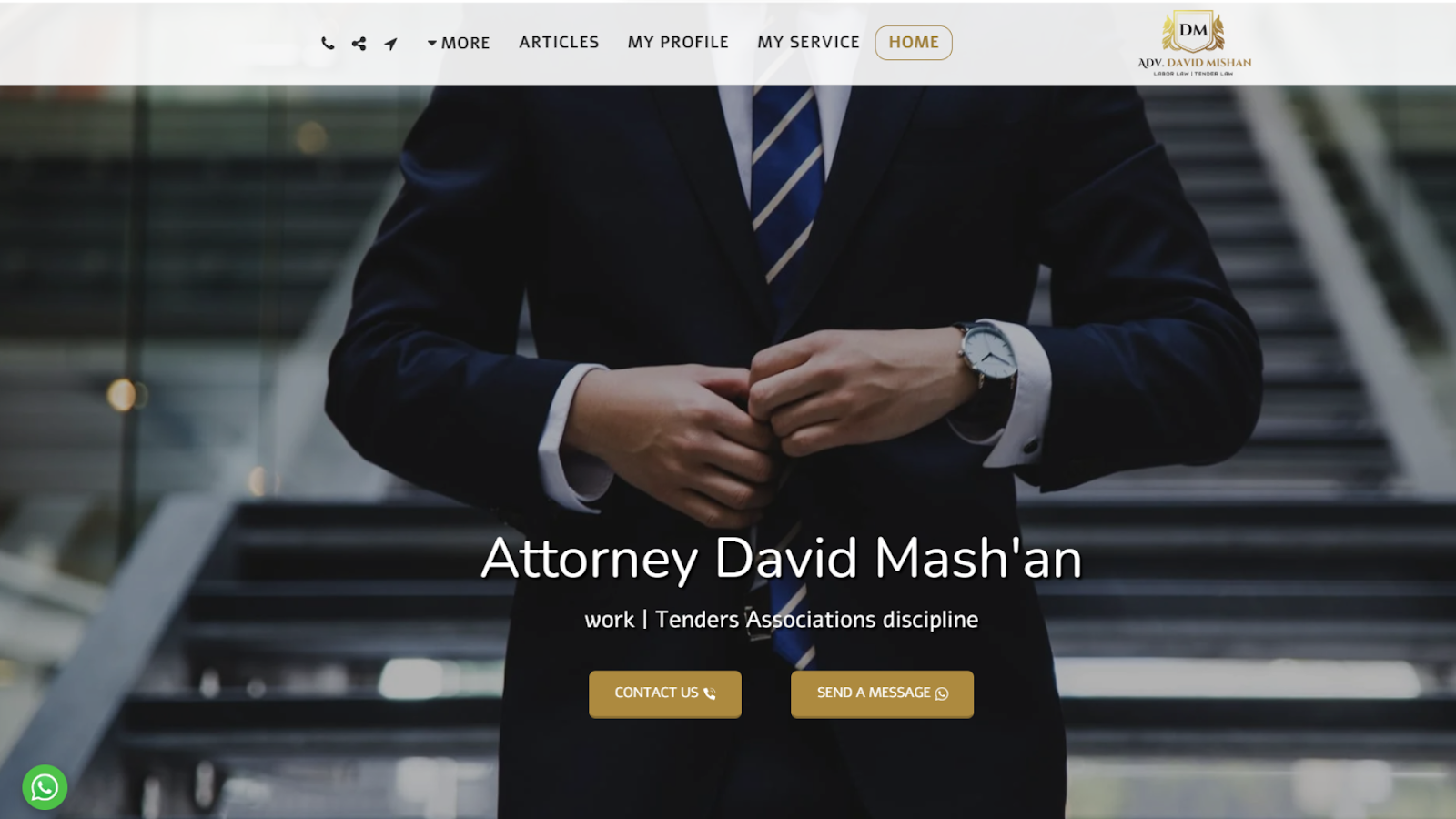
16. Attorney David Mash’an
Add a green Whatsapp button to a serious-looking website to draw attention and get more calls
Visit website at: https://www.mishanlaw.co.il/
This website stands out with its straightforward, accessible design, allowing visitors to quickly glean insight into the lawyer’s expertise in Israeli labor law, tenders, and non-profit organization legalities. The site’s clear, focused content structure is made user-friendly with SITE123’s platform.
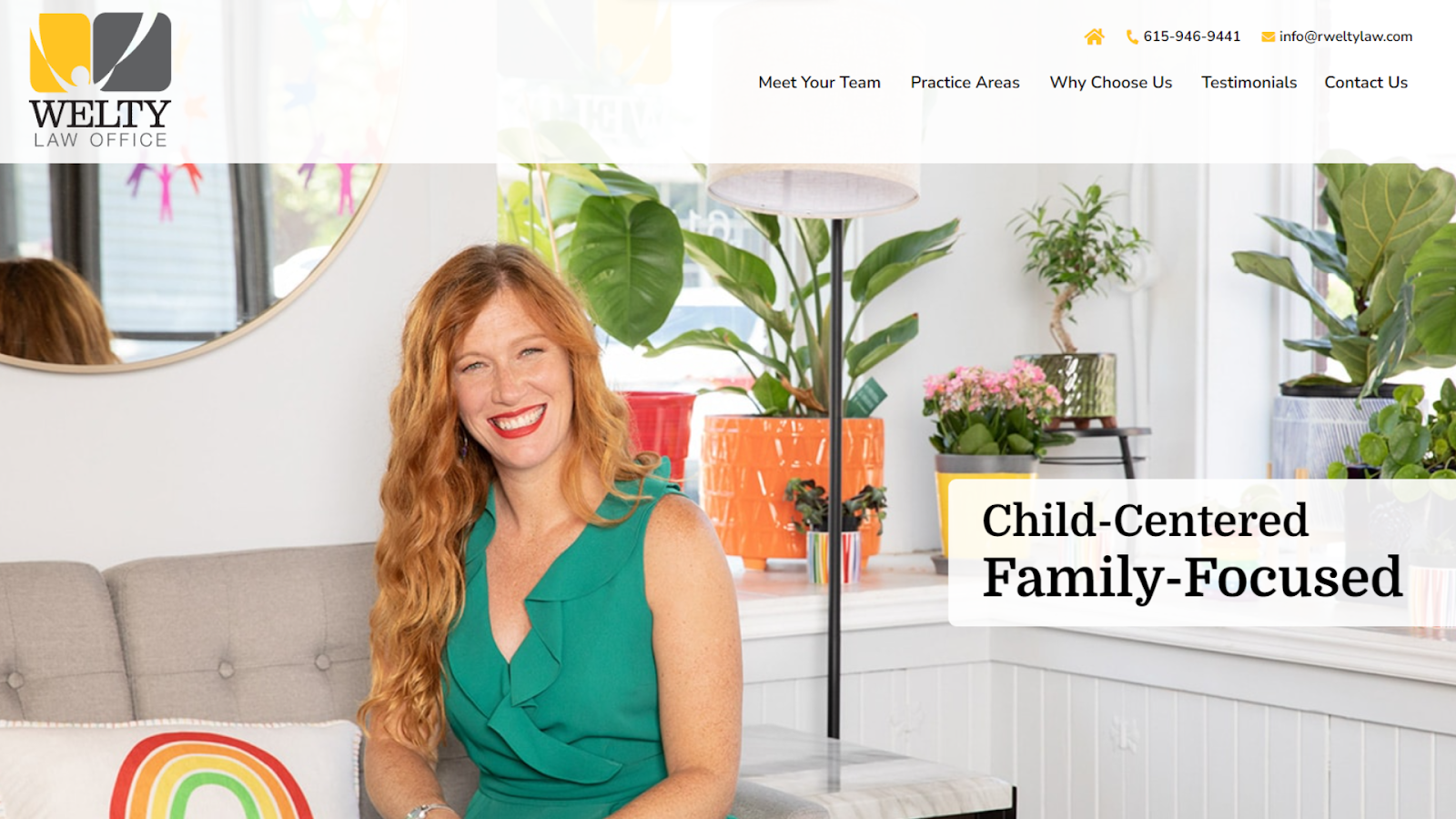
17. Welty Law Office
A well-chosen image for your homepage can do wonders for your client’s first impression as long as it fits your credentials
Visit website at: https://www.rweltylaw.com/
This website presents a focused and warm aesthetic that immediately introduces their specialty in family-focused legal services. The site’s client-centric approach, evident in the prominent testimonials and clear invitations to Meet Your Team, emphasizes personal connection and trust.
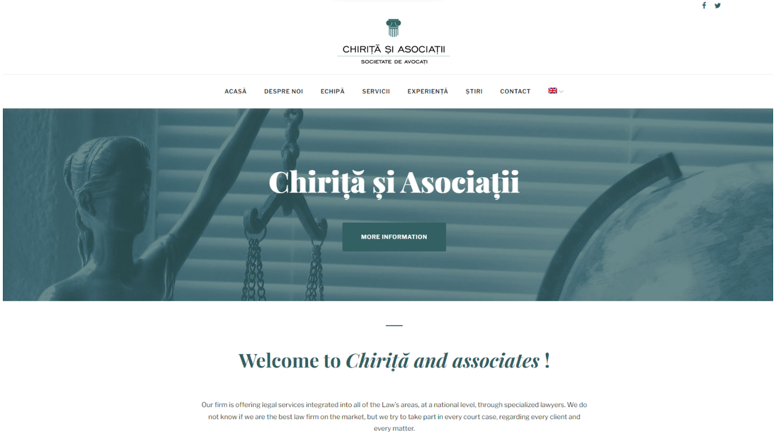
18. Chiriță and Associates
You can match the color of your logo and header image to the one of your text for an organic look
Visit website at: https://www.chirita-law.com/en/
This website is sleek and professional, articulating a legal prowess across multiple disciplines with a special emphasis on supporting foreign companies in Romania. The firm’s multilingual capability ensures comprehensive legal support in English, French, German, Hungarian, and Spanish, catering to a broad international clientele.
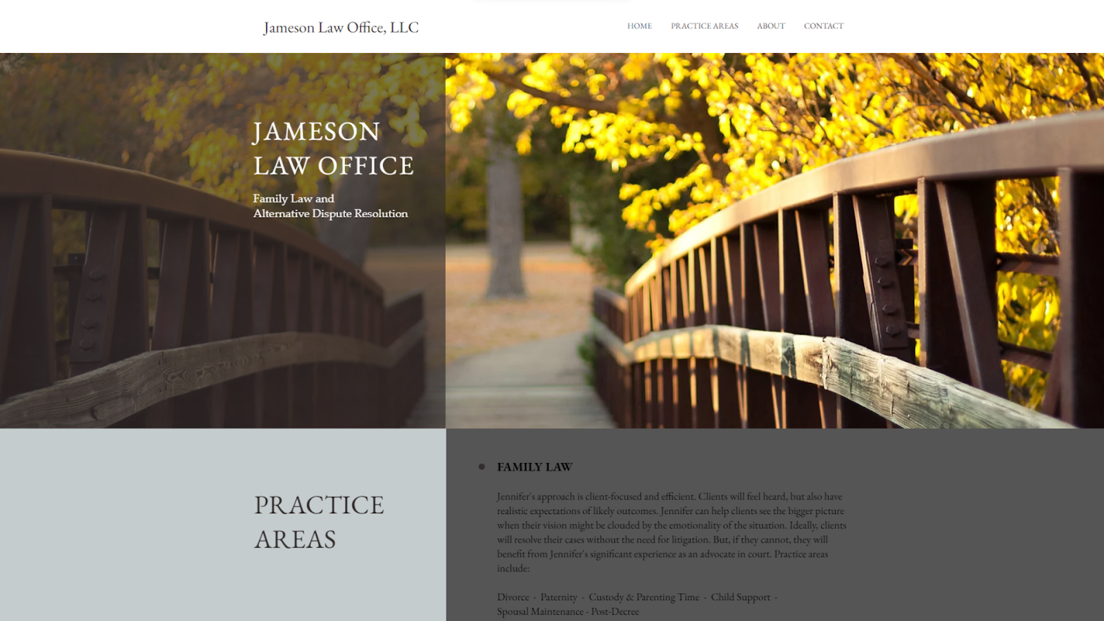
19. Jameson Law Office
This geometric design makes the background turn from cozy to professional
Visit website at: https://www.jamesonlawoffice.com/
This website projects a sense of personalized legal support with its focus on family law and alternative dispute resolution. The site’s clear, empathetic tone promises clients a dedicated and compassionate approach to complex family legal matters. The straightforward navigation buttons for various legal services include a downloadable CV.
The Best Website Builders for Law Firms
These best website builders provide ease of use, intuitive interfaces, polished templates, and legal-industry-specific features such as client bookings and contact forms.
The standout law firm websites we explored earlier are perfect examples of what you can create with these builders. Each was crafted using a website builder, showcasing the potential for high-caliber online spaces that engage and inform potential clients.
Wix is an extremely user-friendly website builder known for its vast selection of customizable templates, perfect for law firms seeking to craft an authoritative online presence. Wix’s drag-and-drop interface ensures that even with no technical background, you can create a polished, professional website with ease.
Key features for the legal niche include Wix Bookings for client appointments, a comprehensive CRM for managing client interactions, and robust SEO tools to help law firms rank higher on search engines. The Wix Owner App is unique to Wix and allows lawyers to manage their practice on the go. Wix Ascend, a suite of marketing and client management tools, is equally handy.
Squarespace offers sleek designs and award-winning templates. For law firms, it’s an elegant platform to showcase their services. It stands out with its all-in-one platform, featuring Squarespace Scheduling for easy appointment setting and an integrated email campaign system to keep in touch with clients.
Squarespace’s advantage is its design-forward approach, ensuring every website looks premium and works seamlessly on all devices. This is coupled with powerful analytics to track visitor behavior and built-in SEO tools for enhanced visibility.
SITE123 is a user-friendly website builder known for its simplicity and ease of use. It is ideal for law firms that want to go online as quickly as possible. Even if this is your first time making a website, you won’t have any trouble navigating the menus of SITE123.
What sets SITE123 apart is its multilingual support, allowing law firms to cater to a diverse client base by creating websites in multiple languages. This feature is particularly beneficial for firms operating in multilingual regions or serving international clients.
Building a professional lawyer website is all about combining functionality with aesthetics. It’s crucial to choose a design that resonates with your legal niche while also adding features like appointment scheduling and client testimonials. Incorporating elements like clear service descriptions, attorney bios, and a blog can also significantly enhance your site’s value to prospective clients.
Wix is my top recommendation since it offers legal professionals a comprehensive suite of tools. With its user-friendly interface, law firm templates, and dedicated features such as Wix Bookings, Wix empowers lawyers to create elegant websites fully equipped to handle the demands of a thriving law practice.
To build a professional lawyer website, select a website builder like Wix with legal-specific templates and features like appointment booking. Focus on clear navigation and professional aesthetics, and include sections like About Us, Services, and Contact.
What are the best design templates for a law firm website?
The best design templates for a law firm website offer a professional look, incorporate legal imagery, and provide space for client testimonials and case studies. Platforms like Squarespace offer award-winning designs that are ideal for law firms.
What should online legal websites look like?
Online legal websites should be professional, informative, and easy to navigate, with a design that instills trust. They should include clear service descriptions, attorney bios, contact information, and accessibility features. See the examples of well-designed legal websites for inspiration.
How can I improve my law firm website?
You can improve your law firm website by ensuring it is mobile-responsive, quick to load, and full of valuable content in the form of blogs or a resource center. Regularly update it with fresh content and optimize for SEO. Consider adding a live chat feature for immediate client engagement. Check out the best website builders for lawyers for more ideas.
Roxana David is a writer specializing in website builders, credit card processors, and project management software. Before joining Website Planet, Roxana honed her writing skills as a successful freelance writer and reviewer for another popular blog. Her diverse academic background includes study of Robotics and Languages at university, making her a well-rounded expert in technology and communication. Beyond her work, Roxana likes to indulge in indie movies and video games, which she writes about on her blog.
Thank you, - your comment was submitted successfully!
We check all user comments within 48 hours to make sure they are from real people like you. We're glad you found this article useful - we would appreciate it if you let more people know about it.
Share this blog post with friends and co-workers right now:
Thank you, , your comment was submitted successfully!
We check all comments within 48 hours to make sure they're from real users like you. In the meantime, you can share your comment with others to let more people know what you think.
Thank you for signing up!
Once a month you will receive interesting, insightful tips, tricks, and advice to improve your website performance and reach your digital marketing goals!