Inside this Article
Benefits of Wordmark Logos
If you’re just starting your branding journey, deciding the type of logo you want to use is a crucial first step. Wordmark logos are often overlooked, but they carry significant benefits.More People Know Your Name
As a small business, getting your name out there is essential to your success. Having your brand name in your logo accelerates this process. It takes anywhere from five to seven impressions for customers to recognize a company emblem; use a wordmark, and it will take the same amount of time for them to remember your company name.Works on Every Platform
Icons can be difficult to resize; too small and you can’t see them properly, and on banners, they can be difficult to place. A wordmark is much easier to edit, as typeface is always scalable. Similarly, it’s easy to blow it up to put on shop fronts, banners, and website headers.Cost Efficient
Since most icon logos require a wordmark addition at some point in the process, skipping the pictorial design and focusing on the lettering elements could save you both time and money!Easier To Create a Unique Design
Only so many icons exist, and most of them have already been used. The world doesn’t need another burger shop with a burger logo, or airline with a plane pictorial. Instead of sticking to worn-out stereotypes, focusing on the lettering will ensure your design is unique and stands out from the crowd.Ensures a Timeless Logo
Like any industry, logo designs have trends that come and go. For example, recently there’s been a resurgence in vintage nautical-themed emblems. Keeping it simple and using a wordmark ensures that your logo won’t go out of style and end up looking dated. It may seem completely overwhelming to create a branding element from a word, but it’s easier than you think. By experimenting with five design factors, you can develop a unique emblem that’s personalized to your company.What to Consider When Creating the Perfect Wordmark Logo
Even if you use the best logo design services available, personally understanding each element of wordmarks is essential. By creating a baseline of knowledge, you can communicate your ideas and translate them into a bespoke emblem. Even if a designer takes on most of the work, specifying your preferences in the brief will centralize your vision in the final design.1. Fonts
Font is the first step to giving your business a visual personality. The type of font you choose communicates a lot about your company. Consider the following:Serif vs. Sans Serif
A serif is the extension added onto letters to change their style. Serif fonts, such as Times New Roman, have a much more traditional feel to them. They work well for companies that want that added sophistication or have a historical slant to their personality.
 Sans serif fonts like Arial or Montserrat retain a much more current mood. They’re ideal for businesses aligned with pop culture or those involved in the technology or information industries.
Script vs. Blocked
Script is a great way to communicate elegance and style. Many high-class organizations opt for script-based emblems, as the calligraphic style is reminiscent of signatures made popular by the historic upper classes. Back then, the ability to write was considered a true privilege.
 On the other hand, blocked lettering inspires trust in the viewer. If you want to portray your business as well-established, secure and trustworthy, then opting for strong, bold fonts is preferable.
Vintage vs. Futuristic
Vintage lettering is ideal for companies that want to hark back to a specific point in time. Maybe you sell clothes inspired by the 1960s or own a shop full of Victorian antiques. As vintage fonts already have a strong character, they’re perfect to use if you want to evoke feelings of particular time periods.
 Futuristic fonts are entirely different. They’re more at home in sci-fi movies, or on the latest tech products. These innovative typefaces are perfect for forward-thinking companies that want their audience to know they’re ahead of their time.
Before you start creating your logo, list some adjectives you feel best describe your brand personality. When you start designing, aim for typefaces that also reflect these descriptors.
2. Character Features
Character features are the bread and butter of wordmark logos. Including a letter that has a distinctive element helps your design stand out from others. Consider the “D” in the Disney logo. That branding is so recognizable that, even without the rest of the word, we know what company it’s advertising.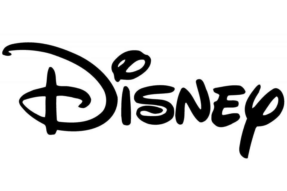
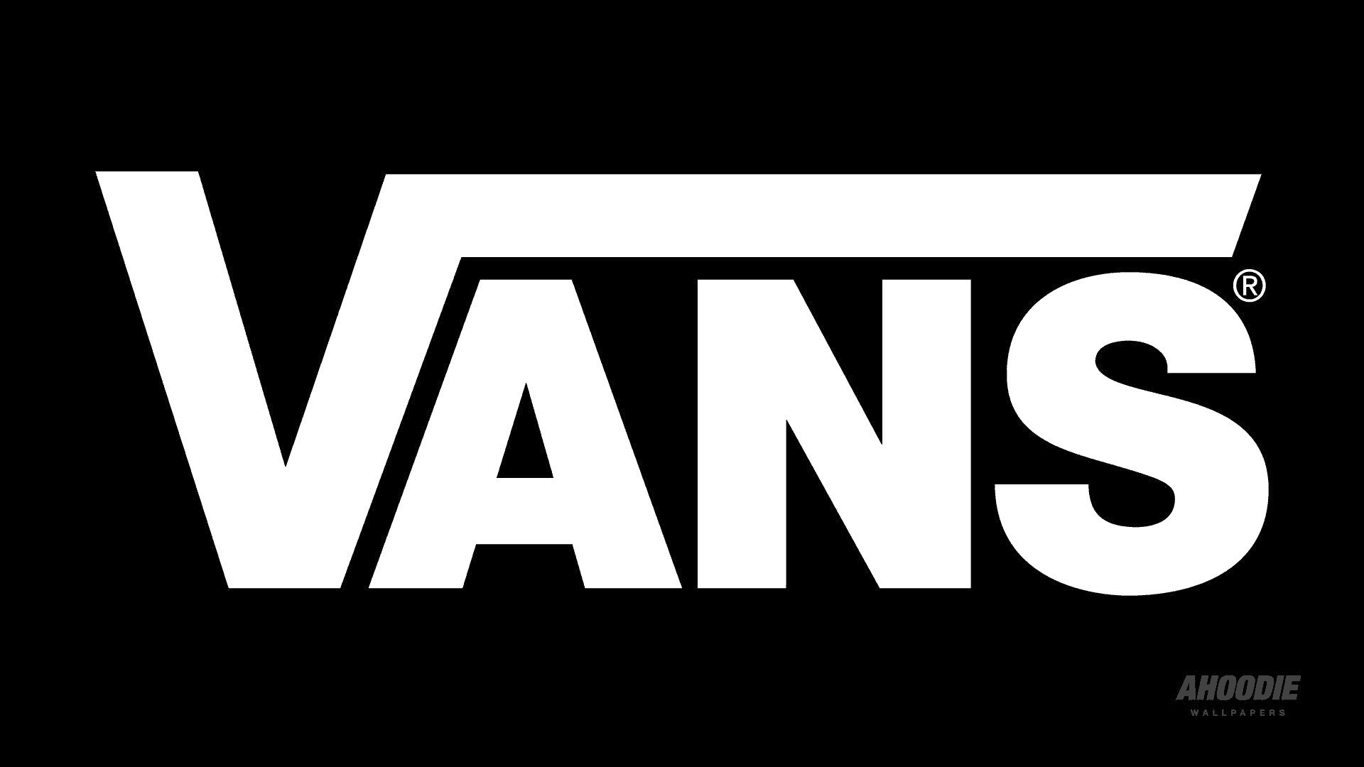
However, it’s essential not to add features for no reason. Make sure the design is representative of your company. You could choose to use that letter as your monogram, or maybe it creates a visual that represents what you’re selling. For examples, the “V” in the Vans logo contains an extended ligature, which makes it look like a skate ramp. Since Vans sells footwear for skateboarders, this character feature is entirely appropriate.
3. Spaces and Cases
Spacing is often overlooked when it comes to wordmark logos. However, the gaps between your letters can be just as significant as the letters themselves. Experiment with increasing and reducing the spacing. Closer together portrays a secure and robust brand; further apart makes it seem more accessible and open. The same is true when it comes to letter cases. Where, or if, you choose to use capitals will change the final impact considerably. For example, a strong, outgoing brand may benefit from using caps for the whole wordmark. On the flip side, if you want to communicate a relaxed, easy-going vibe, then opting for lowercase will help deliver this idea.4. Shapes
Shape is an additional element that can transform a wordmark logo. You can highlight parts of the word that feel relevant, or circle the full wordmark with a shape. Always be aware of any extra meaning this adds. For example, the square around the “in” in LinkedIn’s logo establishes the feeling of inclusivity that the platform aims to provide. The other opportunity to play with shapes is within the negative space of your wordmark. The gaps between letters have the potential to create structures that add even more meaning to the logo. A fantastic example of this is the FedEx wordmark. The space between the “E” and the “x” has been carefully constructed, so it forms a clear arrow shape, which is an ideal symbol for a delivery company.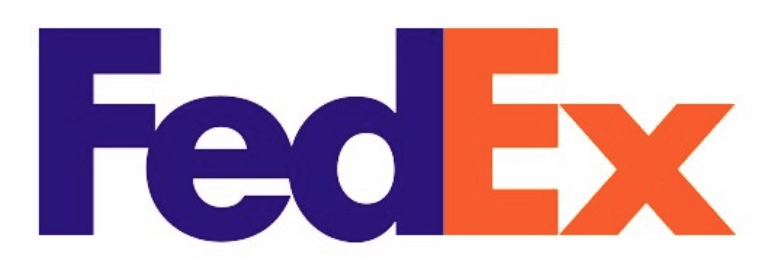
5. Colors
Perhaps the most critical element of your logo is color. The psychology of color is well documented; specific shades inspire different emotions when people see them. To see this in action, simply play around with famous logos and their colors. Would the renowned McDonalds “M” be as successful if it were in black? Or what if the purple Cadbury’s logo were changed to bright red? Neither brand would have the same emotional impact. Here are a few examples illustrating how color operates in branding. Once again, you can contemplate your company’s personality to identify the suitable shades for your brand.- Red: exciting, youthful, bold
- Blue: trustworthy and dependable
- Purple: luxury, elegance, wisdom
- Yellow or Orange: happy, friendly, optimistic
Choose Wordmark Logos for Your Small Business
With this guide, you can create professional-standard wordmark logos for your business. However, this option won’t always be appropriate for everyone. You would most benefit from a wordmark emblem if:- your business name is short (i.e., only one or two words)
- your business name is easy to remember and represents you well
- you don’t need icons to function (e.g., a mobile app couldn’t exist with only a wordmark)





![9 Best Arabic Logos and How to Get One for Free [2025]](https://dt2sdf0db8zob.cloudfront.net/wp-content/uploads/2020/12/9-Arabic-Logo-Designs-and-How-to-Make-Your-Own-for-Free-850x435.jpg)
![9 Best Japanese Logos and How to Get One for Free [2025]](https://dt2sdf0db8zob.cloudfront.net/wp-content/uploads/2020/12/9-Best-Japanese-Logos-and-How-to-Make-Your-Own-for-Free-850x435.jpg)
![21 Best Signature Logos and How To Get Yours for Cheap [2025]](https://dt2sdf0db8zob.cloudfront.net/wp-content/uploads/2020/11/9-Best-Signature-Logos-and-How-to-Make-Your-Own-for-Free-850x435.jpg)
![9 Best Podcast Logos and How to Get One for Free [2025]](https://dt2sdf0db8zob.cloudfront.net/wp-content/uploads/2020/08/9-Best-Podcast-Logos-and-How-to-Make-Your-Own-for-Free-850x435.jpg)
