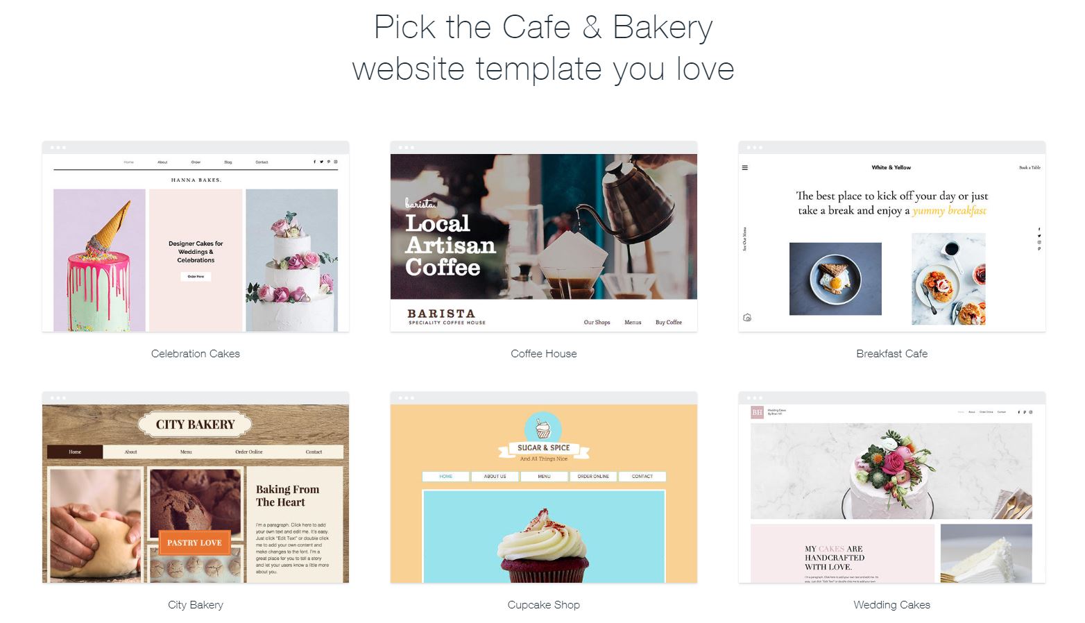
 We’ve scoured the web for 20 of the most hunger-inducing bakery websites from all over the world. And let me tell you, it wasn’t easy. Even now, I’m a very hungry author. But these websites aren’t just pages with beautiful pictures of luscious baked goodness — they offer so much more, and you will be inspired.
And if you want to build your own bakery website when this is all done, we’ve dug into some of the top website builders out there to see which can really help you out! Jump right down to see a comparison table.
For those of you about to dive into these yummy-looking sites on an empty stomach, we salute you.
Sweet Delight
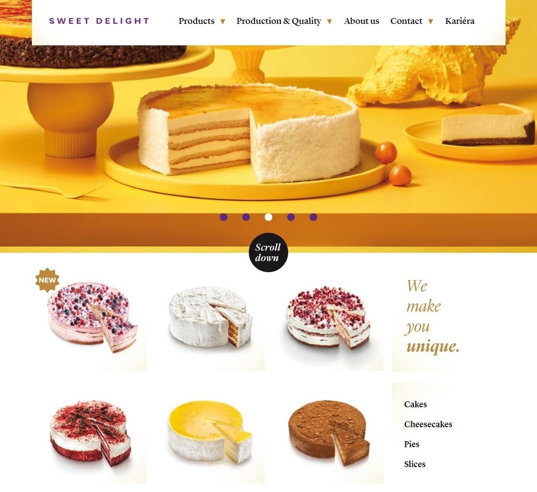 Sweet Delight makes colorful and unique-looking desserts (such as a chocolate-mango-chilli cake!), and uses that to great effect in its design. Where many websites take the “Here’s a huge picture of one dessert” approach, this one does all it can to show off the variety of treats on offer.
I also particularly like that for the elements with a white background set against more white, there are subtle gradients at the corners to indicate boundaries. These gradients aren’t essential, but on this particular site, they’re a nice touch.
Passarella
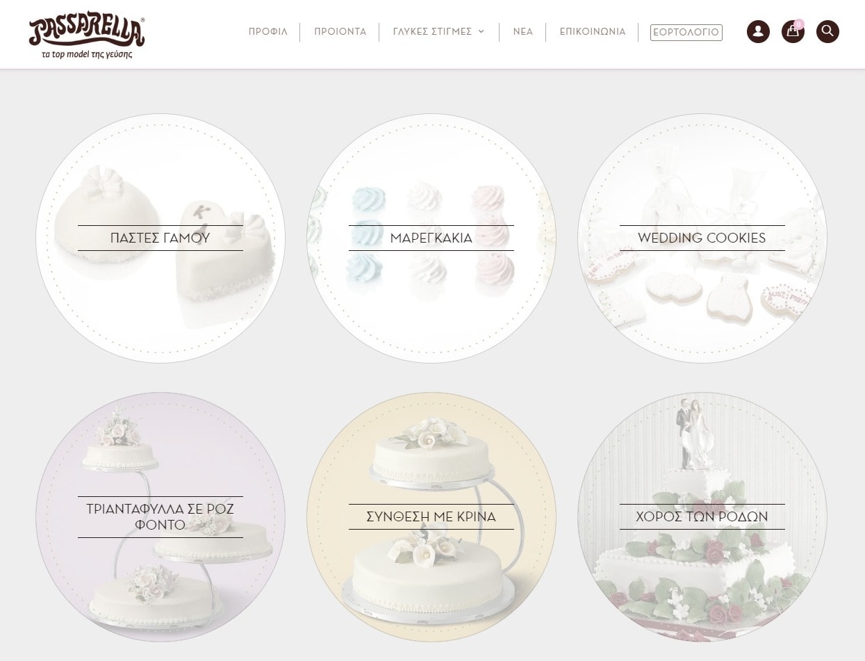 Passarella’s website goes all out for the classic pastels and thin borders, and this works wonderfully with the Greek typography. It’s like the two elements were made for each other. As a designer, I’m nerding out about that more than the photos of the food which are, if you’ll forgive me, merely the icing on the cake.
The website also uses lots of descriptive text, which is good for SEO – something often neglected by similar sites.
Grandir
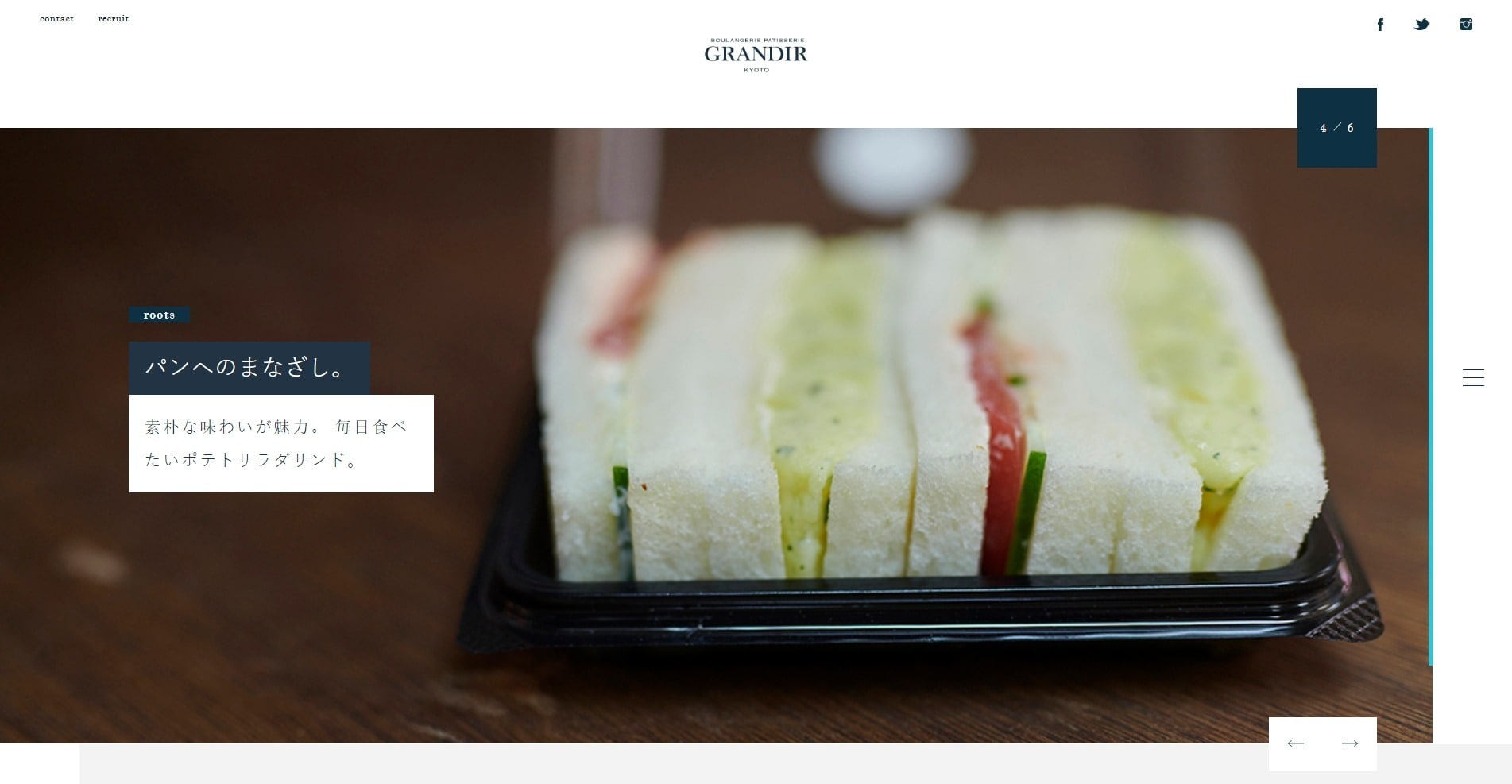 Grandir is a bakery in Japan, and nobody does elegance-and-tons-of-empty-space quite like the Japanese designers I’ve encountered. The aesthetic is a mix of Western layout and site structure and Japanese-style minimalism that you’ll quickly come to recognize if you see enough websites like this.
What you won’t see in the screenshot are the cinematic-feeling animations, so you should really visit Grandir’s website!

Boudin
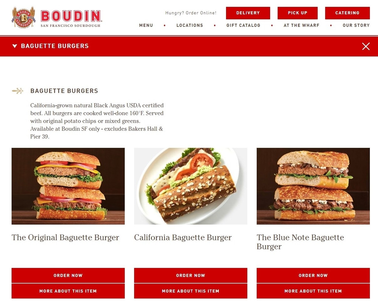 Boudin makes everything from regular bread to pizza, but it specializes in good old sandwiches. The website embraces a classic feel for a classic meal, evoking a sense of history with mostly serif-based typography, a light touch of brown, and lots of solid red.
I particularly like that the bakery has an entire section devoted to buying its sandwiches and other foods as gifts for other people. There are also “bread clubs” you can sign up for to get regular bread. Now there’s an online business model!
Pro Tip: Keep Your Menu Updated with Wix
If you serve any of your goods on location, such as in a cafe/bakery, Wix has a menu-building app that you can install for free from its App Market. It’s SEO-friendly, and integrates with social services like Facebook Pages and Foursquare, so you can show off your wares all over the Internet. To learn more about Wix, check out our Wix expert review.Niedlov’s Breadworks
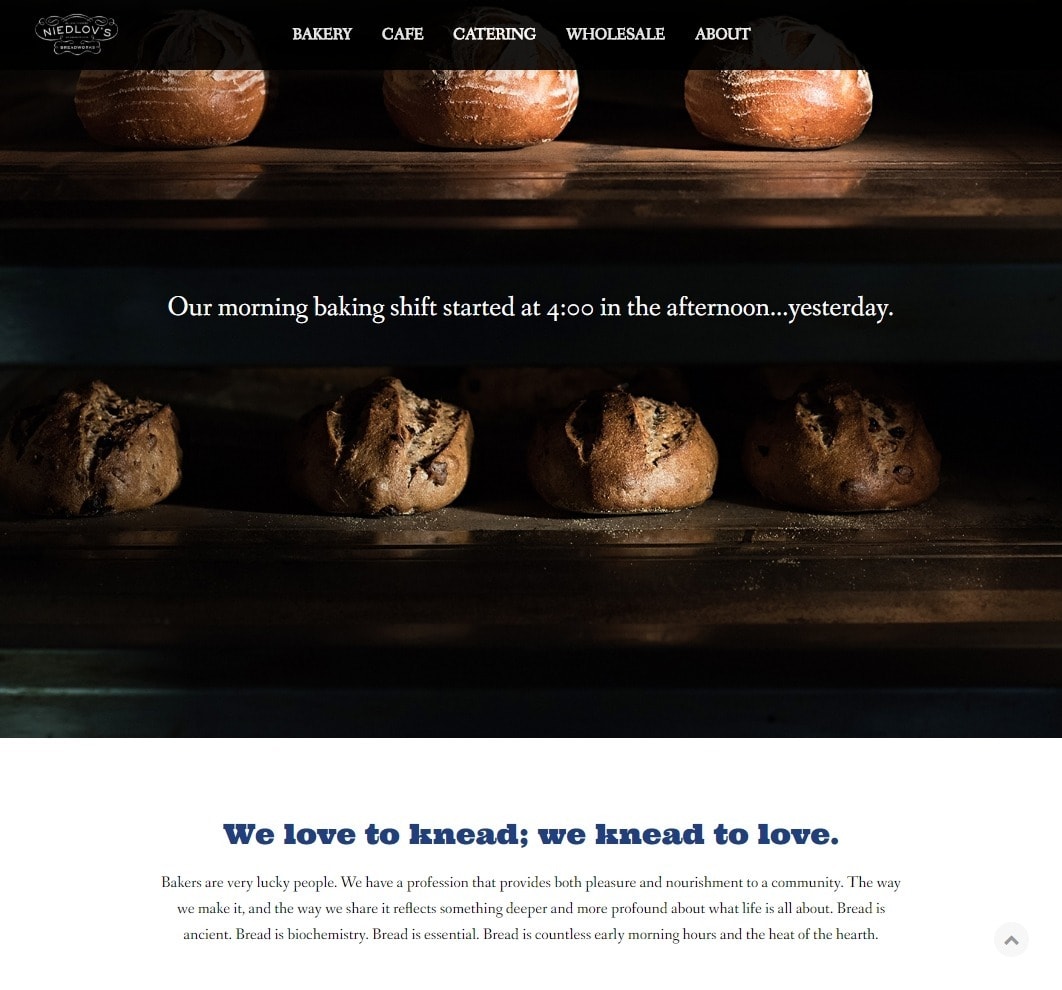 Niedlov’s Breadworks is both a cafe and a wholesale bakery, so the site has been tailored to match. The whole thing feels very minimalist, and very “upscale coffee shop,” targeting individual and wholesale customers alike.
There are PDF versions of the menus, which is an interesting touch, and one I’m unsure I’d go with myself. Then again, if the owners ever want to change the menu, they can easily just upload new PDFs.
Levain
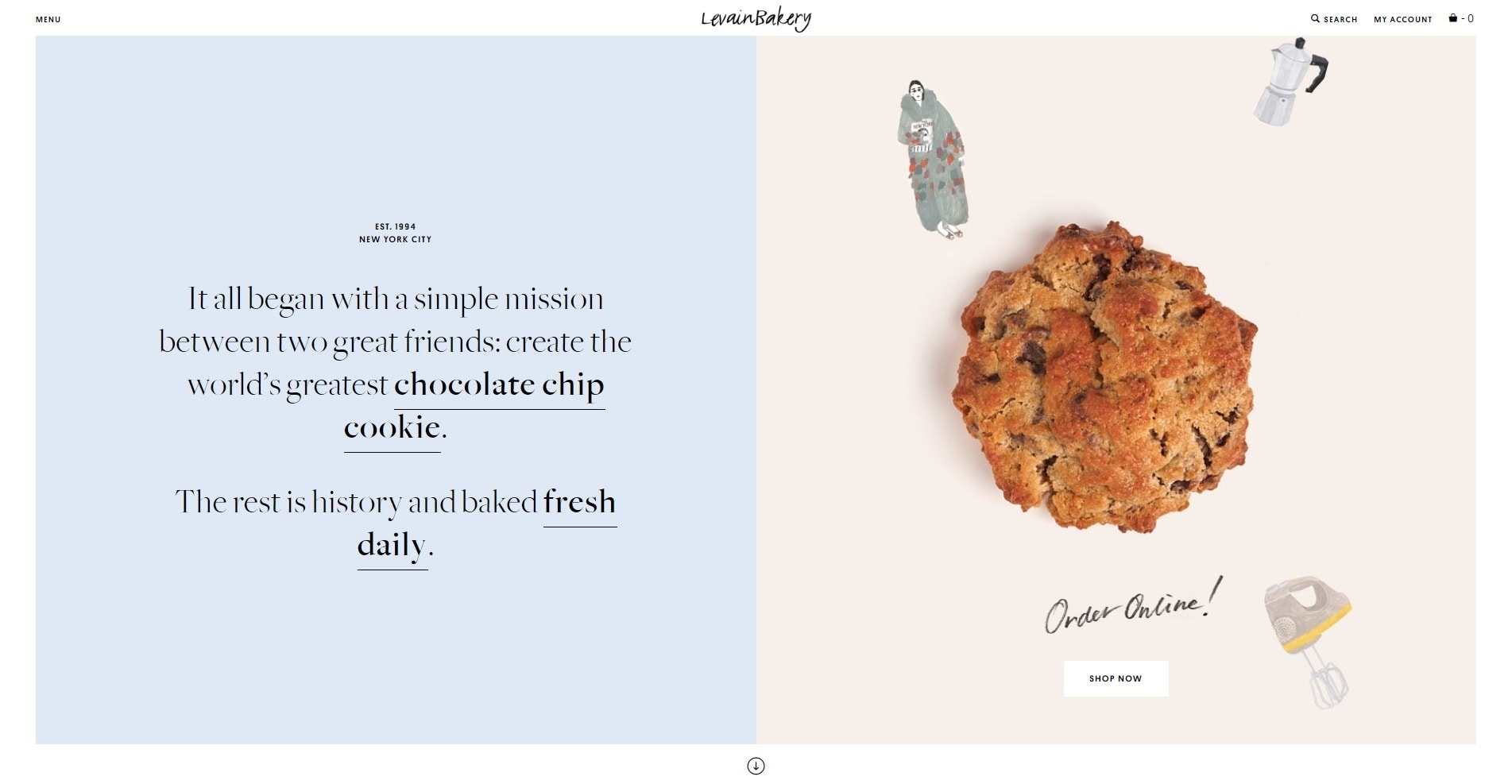 If I had to describe the aesthetic for Levain, I’d go with “cosmopolitan pastels.” All of the bakery’s branches are in New York City, and somehow even the watercolor elements on its website seem to convey this.
There’s also a “line cam,” which is a live video feed from a couple of Levain’s locations. For one branch, the cam overlooks the counter where scrumptious cookies are on display — just one more way to make people hungry, I guess.
Hanz & Franz
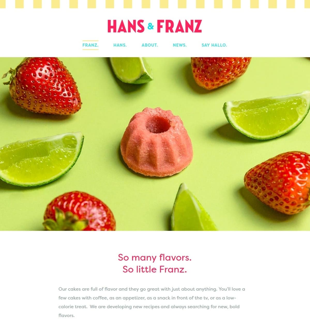 Hanz & Franz specializes in miniature cakes, so the whole aesthetic is playful, colorful, and generally meant to convey the taste explosion you’re sure to get from the mini-cakes… which are in no way cupcakes, apparently.
There’s some very carefully coordinated photography with excellent contrast between the mini cakes and the backgrounds. That sort of contrast permeates the whole design, creating a beautiful theme.
Gruber Bakery
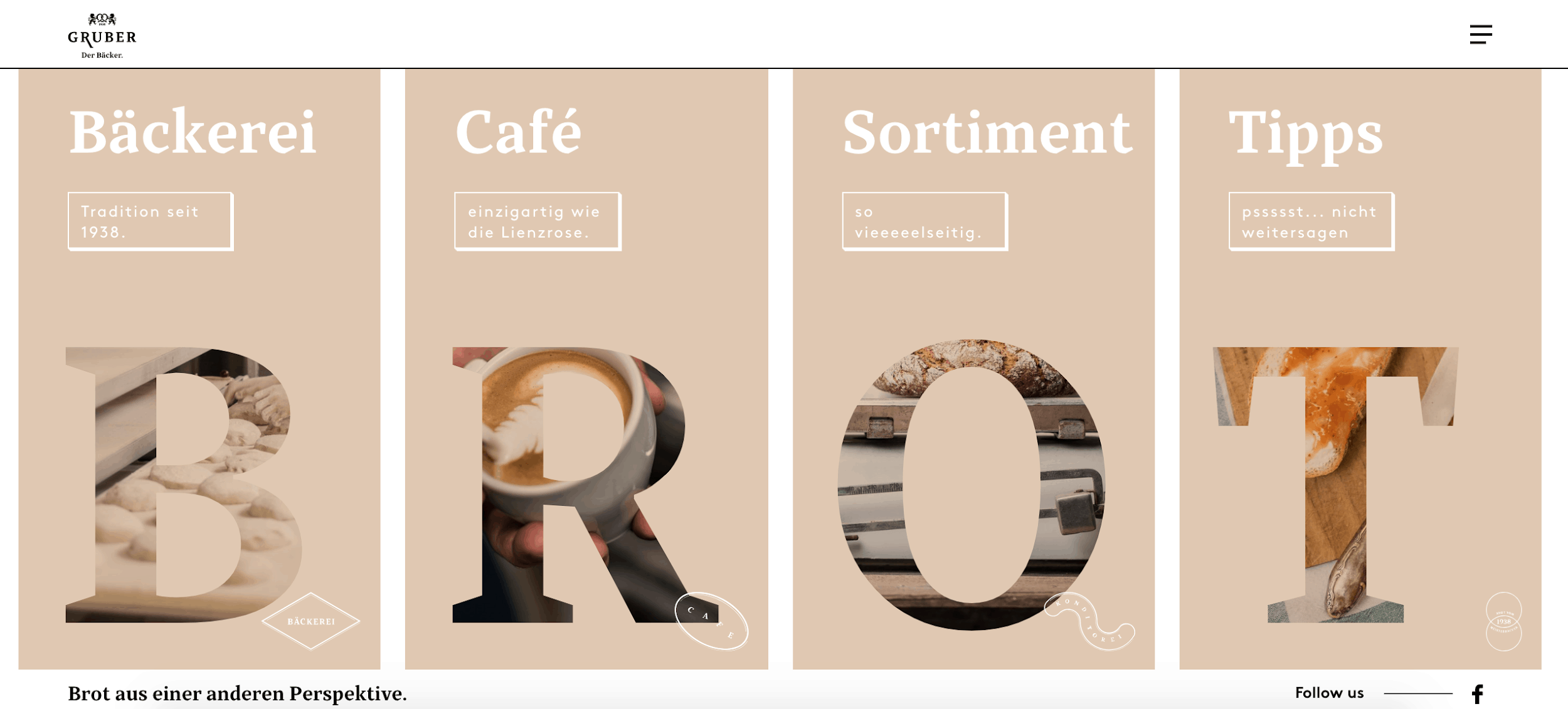 The Austrian Gruber Bakery has nothing to do with Die Hard villain Hans Gruber, and everything to do with fine breads and very modernist web design.
With its masses of (often literal) white space, modernist typography, and pseudo-3D borders on the buttons, the whole website conveys a new approach to the ancient art of baking. Plus, there’s a video trailer for the bakery you can watch.
Pro Tip: GoDaddy Gets You Started Fast
If you’re using Godaddy’s website builder, GoCentral, there will come a point when you’re asked what kind of site you want to make. Just type in “bakery,” and you’ll automatically get designs good for most bakeries! There’s more than one, of course, and you can change the template at any time. If you’d like to learn more about the platform, check out this GoDaddy expert review.Mira Cake House
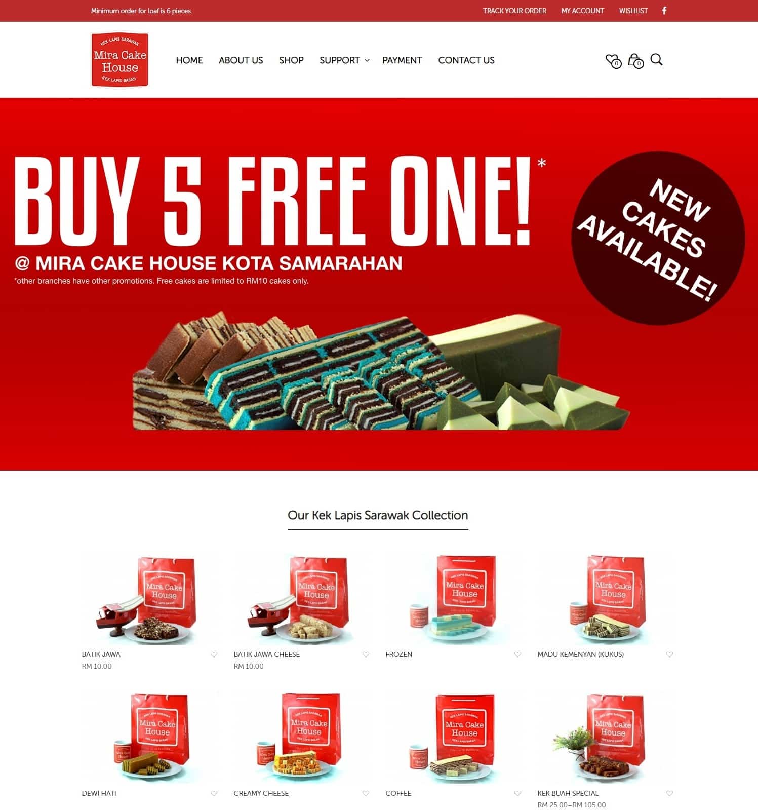 Mira Cake House is an interesting one, because it’s a chain of bakeries. It’s also an online shop that sells the company’s own patented cake mixes.
In order to meet the demands of such a varied clientele, the website’s design is more oriented toward business than nostalgia, with heavy emphasis on a smooth online shopping experience. The owners probably figure you’re already hungry, so they decided to just get on with selling you their products. It certainly seems to be working for them.
Emporium Pies
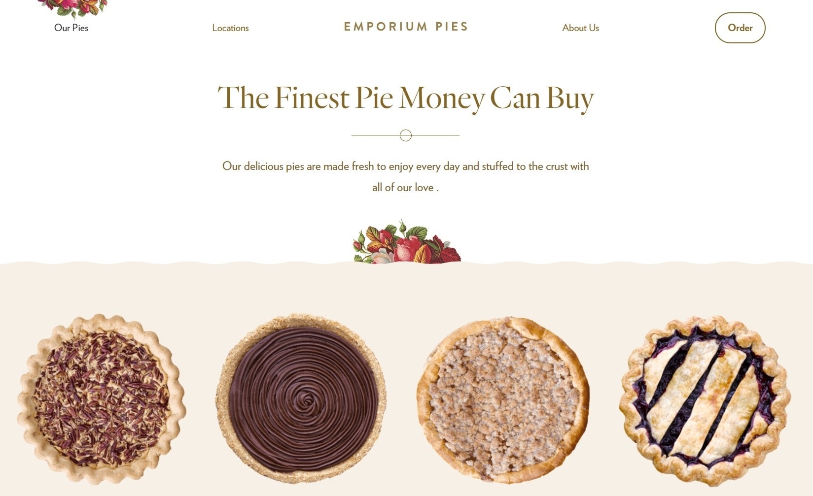 Emporium Pies has nice big pictures of its pies, of course. But more than that, it has an aesthetic that’s unapologetically sentimental. These are pies, so they’re supposed to make you think of home and summer days, and the website’s look doesn’t hold back from this.
I also appreciate that while the site is clearly designed to have plenty of animation, it doesn’t feel overdone. You can just sense the love for pies.
Mah ze Dahr Bakery
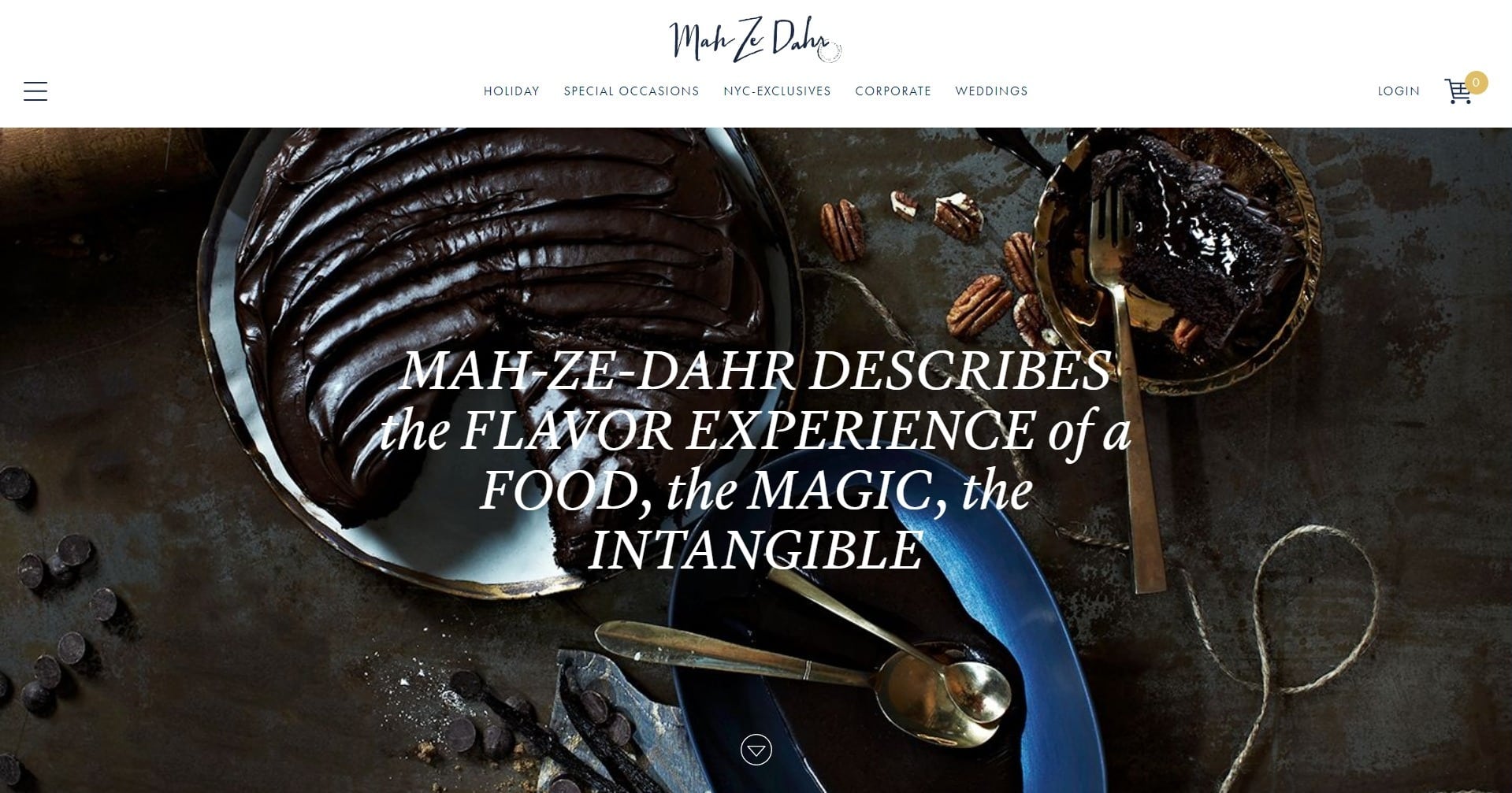 The Mah ze Dahr Bakery does catering for events. That’s probably why the website showcases the aesthetic elegance you’d expect from, say, a wedding planner’s website.
I particularly like how the products are organized by the occasion you might want to buy them for. There are the usual categories for weddings and corporate parties, but also for telling someone you miss them, offering congratulations, and even wishing that someone gets well soon. This bakery meets a need that many others don’t even consider.
La Brea Bakery
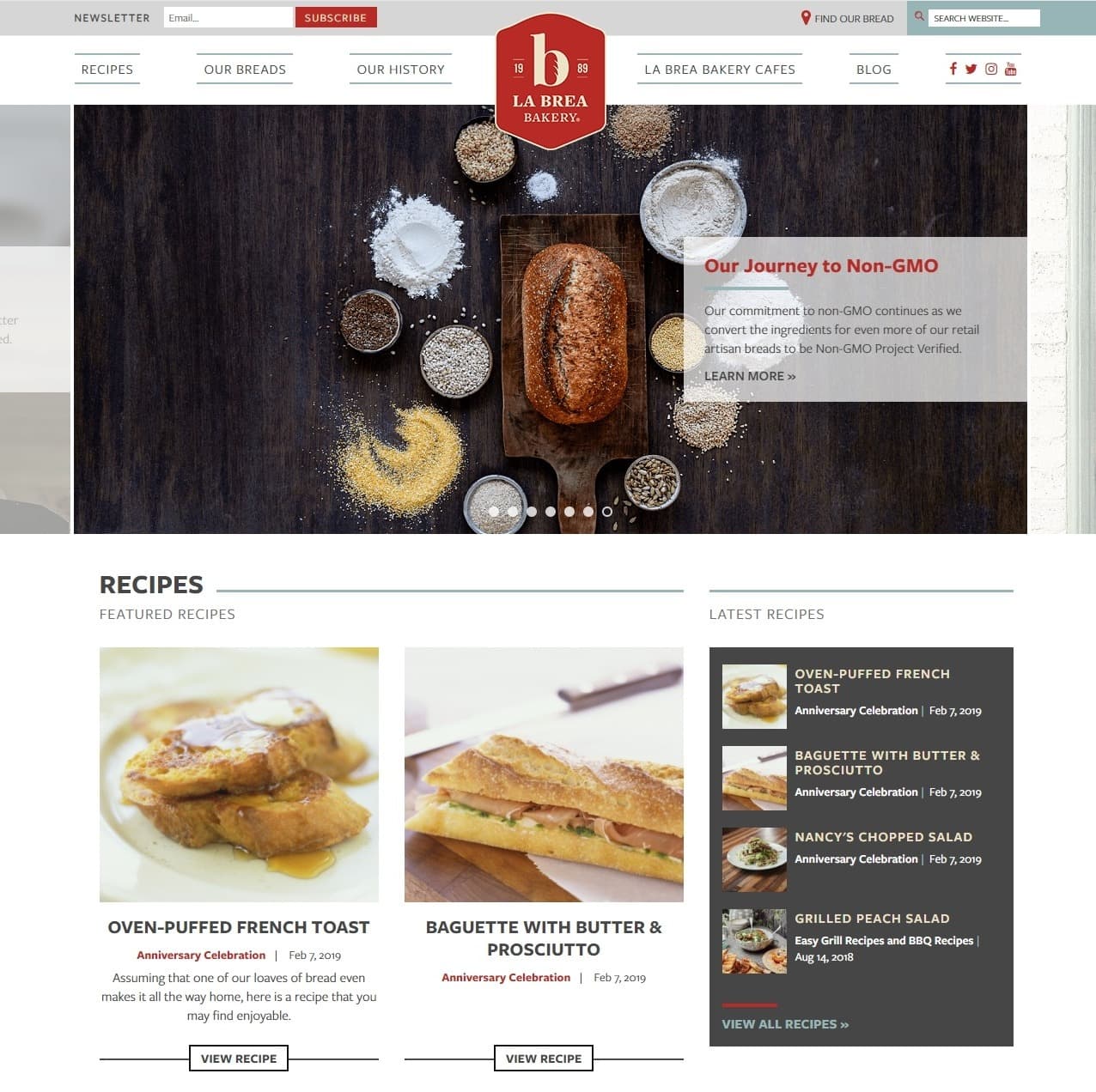 As the La Brea Bakery offers a lot of products and services, it has adopted a modern version of the classic web portal layout. This is well-suited to displaying a lot of information at a glance. There’s also a very clear emphasis on blogging as a part of the bakery’s content/marketing strategy, which is better served by a more classic web experience than an artsy design.
Pro Tip: Squarespace’s Templates Are Expertly Designed
Squarespace is one of the few website builders that doesn’t have a free version. However, its template designs are arguably the best out of the bunch. While there are not too many specifically dedicated to bakeries, you’ll have lots of options from other industries that can easily be tweaked to match whatever style you are looking for. If your aesthetic design doesn’t extend far beyond baked goods, Squarespace is a good way to ensure you’ll have a beautiful website. Find out more about Squarespace by reading our Squarespace expert review.Fox in the Snow
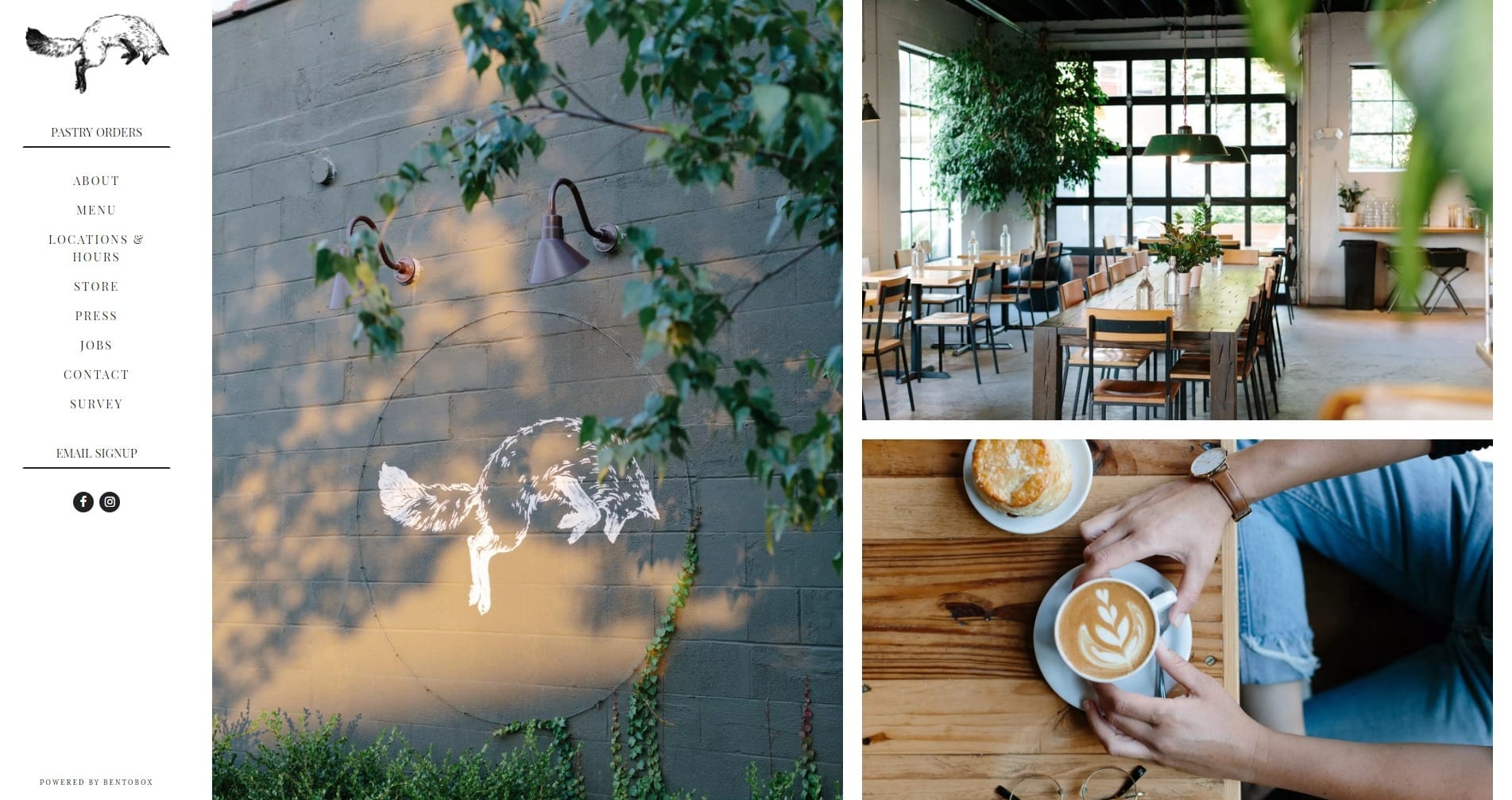 Fox in the Snow is a bakery and coffee shop that leans hard into the hipster aesthetic. The entire website is in some ways reminiscent of a printed menu, and relies heavily on elegant typography to elevate the experience. While it could use a bit more visual contrast in some places (a common failing in hipster-style designs), the overall effect is pleasing to the eye.
Tartine Bakery
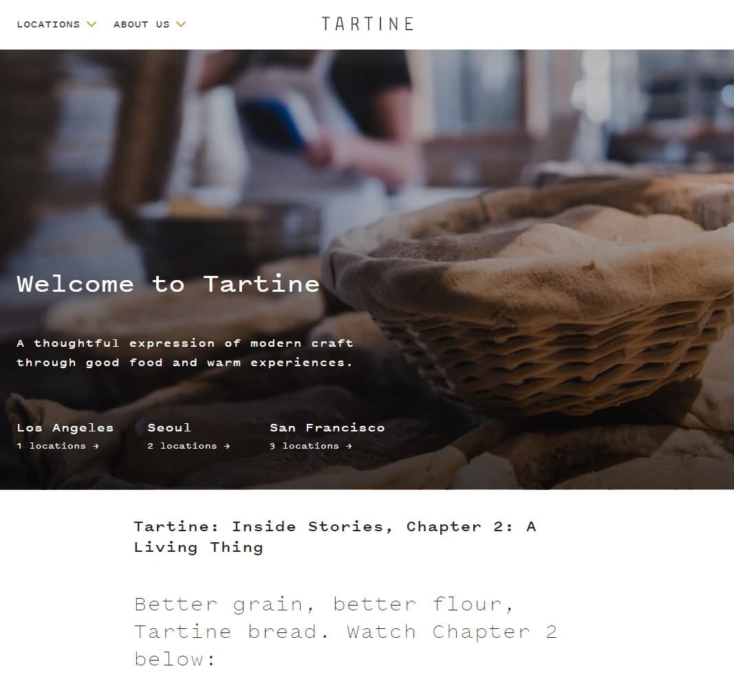 Did I say that last website is somewhat hipster? Well it is, but Tartine Bakery has them beat. This bakery takes the hipster look, throws in some monospaced type and a more modernist style of layout, and then adds some actual mini-documentaries. That’s right, documentaries. It’s no live camera feed, but it is rather “extra.” But hey, that’s what we pay for in an artisanal bakery.
Lune Croissanterie
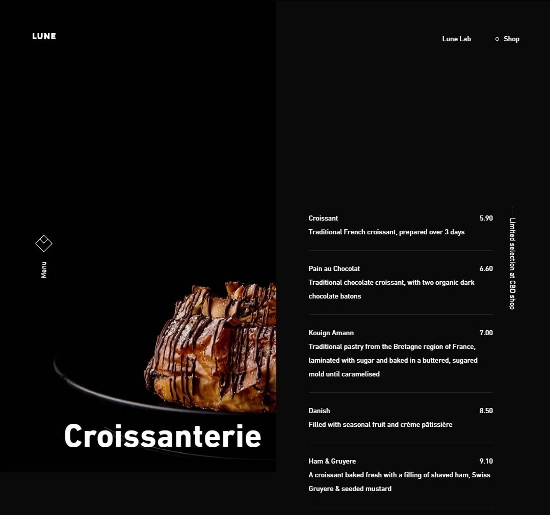 The Lune Croissanterie is, as you might have guessed, all about the croissants. With only one kind of product to show off, this bakery has one of the most minimalist websites on this list. And because it has less content to worry about, it can afford to use a sort of asymmetry-themed layout with overlapping elements that feels a bit like a collage. Very artsy indeed.
Magnolia Bakery
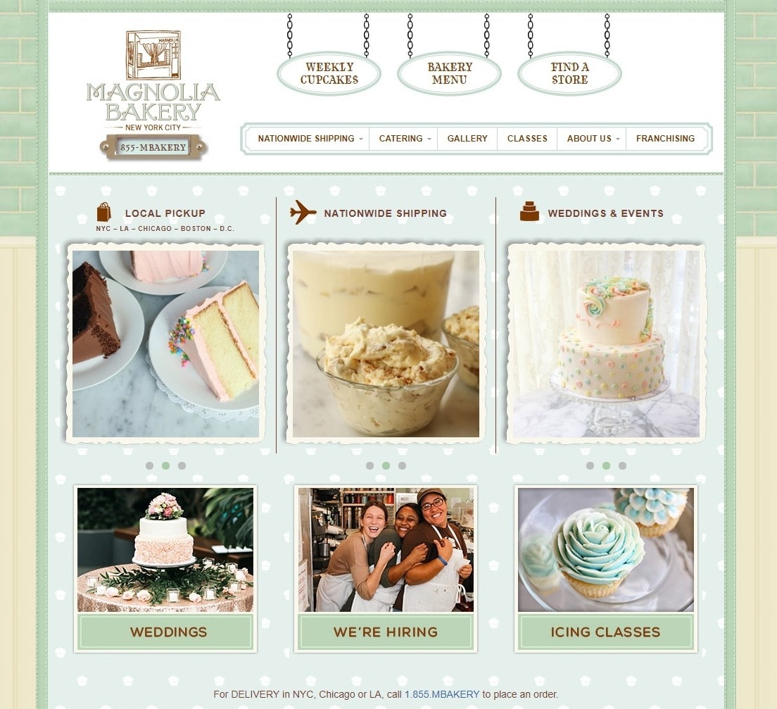 The Magnolia Bakery’s website goes back to the old days when textures and pseudo-3D elements were everywhere. It’s designed to be, in a word, cute. The website, older than most on this list, is adaptive, but not quite responsive — with a clear delineation between “the desktop design” and “the mobile design.”
But that dated look is exactly what makes it feel kind of sweet and authentic. It’s a good reminder that being genuine is more important than being perfect.
Pro Tip: SITE123 Offers Custom Forms
Some businesses can make do with a standard product order form, but bakeries often have very specific needs. Fortunately, SITE123 offers something better: custom forms for every conceivable use case. They need a bit more work to set up, but you can make sure you’re getting exactly the information you need from customers. Check out our SITE123 expert review if you want more information about the platform.The Radford’s Pie Company
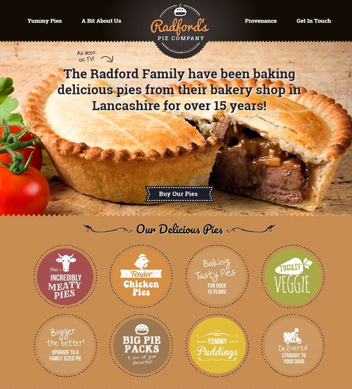 The Radford’s Pie Company is an anomaly on this list, mostly because the company’s pies are filled with meat. But that’s still baking!
The website has that somewhat-too-polished handmade look that only computers can truly achieve. That’s not a bad thing — it fits the business. I particularly like the bits that actually do look hand-drawn, though.
Cafe Studio Bakery
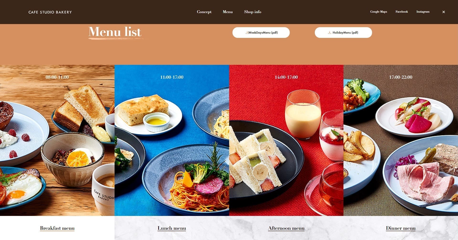 Cafe Studio Bakery is another one from Japan, but the web experience is a bit more traditional. Oh, it’s still elegant, to be sure, but there’s a bit less white space, which has been infused with subtle hints of texture here and there.
And the animations are more like what you’ve probably encountered on the web before. That’s not a bad thing: While new visual sensations are striking and memorable, familiarity can help new visitors feel comfortable.
Pekara Dubravica
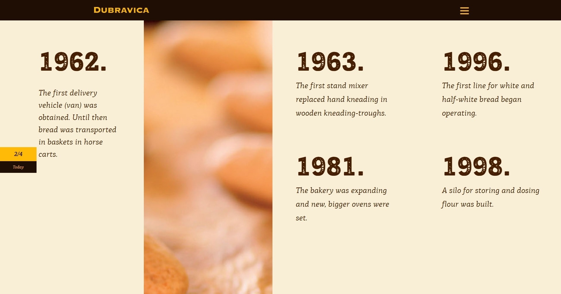 Surely the owners of Pekara Dubravica want you to see their products and go to their stores, but that can wait. It seems like before anything else, they want you to learn about the bakery’s story.
Although you can access any part of the website right away via the navigation, the very first call to action you encounter takes you through the nostalgia-fueled history of the business. It’s a distinct approach — perhaps distinct enough to make the website stay in the customer’s mind.
Greyston Bakery
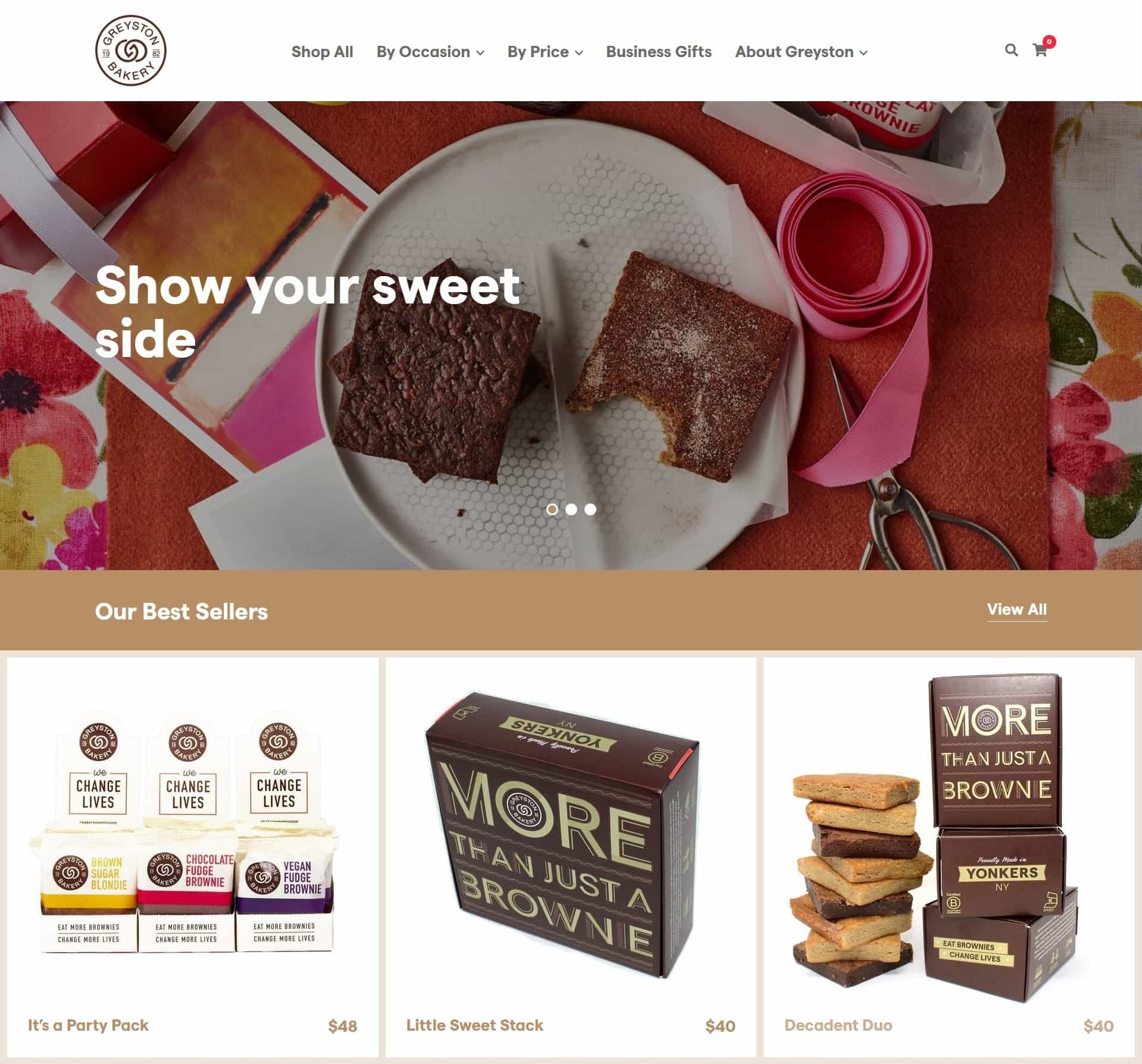 Greyston Bakery provides a fantastic example of how to use up all the space on the screen at large resolutions. The website is not the only one on this list to do that, but it’s one of the best. While it’s definitely important to have an optimized mobile experience, the desktop experience can occasionally feel a bit left out. Good responsive design means you can do both.
I also particularly like that there’s an option to sort products by price range in the navigation menu. That’s great for people on a budget.
Pro Tip: WordPress Provides Endless Functionality
WordPress is more technical than the other website builders on this list, but this can also give you a huge amount of flexibility when it comes to building your bakery’s website. With access to third party plugins, you can essentially add endless functionality. For example, you can post a menu and your prices, allow your customers to book tables, schedule food pick up and delivery, include ratings, and about a million other things! Feel free to read our WordPress expert review to learn more.Great Baking Brings Joy, and Great Bakery Websites Remind Us of That
Baking involves a high level of creativity, blending knowledge, technique, passion, and a generous dose of love to craft something that fills people’s lives with happiness. When you’re constructing a bakery website, the key lies in expressing this emotion without overly relying on clichés. Some bakeries achieve this by simply displaying their creations, while others concentrate on sharing their narrative. And yet, some just place the “Buy” button right in front of you, allowing you to make your own choice. Whatever the approach, if they’ve made you hungry, if they’ve made you remember the joy of every bite, then they’ve probably won.Does this list have you all inspired and ready to go? Great! You can build your very own bakery website with little fuss by using the website builders we mentioned in this article. To help you make your choice, we dug a little deeper to find out which ones had the right combination of themes and features to get you started. Have a look below, and enjoy!
| Site Builder | Bakery-suitable themes | Online Store | Order forms | Directions / maps widgets | Bookings widget | Reservations |
| Wix | 12 | ✔ | ✔ | ✔ | ✔ | ✔ |
| GoDaddy | 20 | ✔ | ✔ | ✔ | ✔ | ✔ |
| Squarespace | 3 | ✔ | ✔ | ✔ | ✔ | ✔ |
| SITE123 | Uses a modular system instead of themes with a specific purpose | ✔ | ✘ (but there’s a custom form builder available) | ✔ | ✔ | ✔ |
| WordPress | Many (third party) | ✔ | ✔ | ✔ | ✔ | ✔ |


![10 Best Website Builders To Create Free Church Websites [2024]](https://dt2sdf0db8zob.cloudfront.net/wp-content/uploads/2024/09/Free-Church-Websites-1.png)
![10 Best Website Builders To Create Free Church Websites [2024]](https://dt2sdf0db8zob.cloudfront.net/wp-content/uploads/2023/12/Stephen-Wright-150x150.png)

